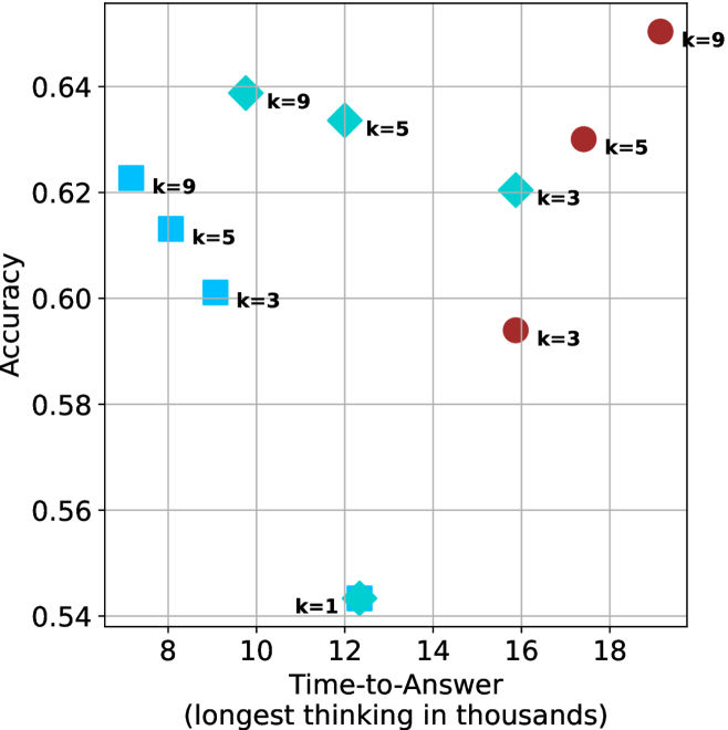
## Scatter Plot: Accuracy vs. Time-to-Answer for Different 'k' Values
### Overview
The image is a scatter plot chart displaying the relationship between "Accuracy" (y-axis) and "Time-to-Answer" (x-axis) for various data points. Each point is labeled with a "k=" value, indicating a parameter or condition. The data is represented using three distinct marker shapes and colors, suggesting three different series or categories.
### Components/Axes
* **X-Axis:** Labeled "Time-to-Answer (longest thinking in thousands)". The scale runs from approximately 7 to 19, with major tick marks at 8, 10, 12, 14, 16, and 18. The unit is "thousands," implying the values represent thousands of units (e.g., tokens, steps, or milliseconds).
* **Y-Axis:** Labeled "Accuracy". The scale runs from 0.54 to approximately 0.65, with major tick marks at 0.54, 0.56, 0.58, 0.60, 0.62, and 0.64.
* **Data Series & Legend (Inferred):** There is no explicit legend box. The series are distinguished by marker shape and color, which are consistently paired with specific "k" value ranges:
* **Cyan Squares:** Associated with k=3, k=5, and k=9.
* **Teal Diamonds:** Associated with k=1, k=3, k=5, and k=9.
* **Maroon Circles:** Associated with k=3, k=5, and k=9.
* **Data Point Labels:** Each marker has a text label directly adjacent to it, stating its "k" value (e.g., "k=9").
### Detailed Analysis
**Data Point Extraction (Approximate Values):**
| Marker (Color/Shape) | k-Value | Time-to-Answer (x, thousands) | Accuracy (y) | Position in Plot |
| :--- | :--- | :--- | :--- | :--- |
| Cyan Square | k=9 | ~7.5 | ~0.623 | Left side, mid-height |
| Cyan Square | k=5 | ~8.0 | ~0.613 | Left side, slightly lower |
| Cyan Square | k=3 | ~9.0 | ~0.601 | Left-center, lower |
| Teal Diamond | k=9 | ~9.8 | ~0.639 | Center-left, high |
| Teal Diamond | k=5 | ~12.2 | ~0.634 | Center, high |
| Teal Diamond | k=3 | ~15.8 | ~0.621 | Center-right, mid-height |
| Teal Diamond | k=1 | ~12.5 | ~0.543 | Center, very low (outlier) |
| Maroon Circle | k=3 | ~15.8 | ~0.594 | Center-right, lower |
| Maroon Circle | k=5 | ~17.5 | ~0.630 | Right side, high |
| Maroon Circle | k=9 | ~19.0 | ~0.650 | Far right, highest point |
**Trend Verification by Series:**
* **Cyan Squares (k=3,5,9):** This series shows a clear **downward trend**. As Time-to-Answer increases from ~7.5 to ~9.0, Accuracy decreases from ~0.623 to ~0.601.
* **Teal Diamonds (k=1,3,5,9):** This series shows a **non-monotonic, scattered trend**. The highest accuracy points (k=9, k=5) are at moderate times (~9.8, ~12.2). Accuracy then dips for k=3 at a higher time (~15.8). The k=1 point is a significant outlier with very low accuracy at a moderate time (~12.5).
* **Maroon Circles (k=3,5,9):** This series shows a general **upward trend**. As Time-to-Answer increases from ~15.8 to ~19.0, Accuracy increases from ~0.594 to ~0.650.
### Key Observations
1. **Performance Trade-off:** There is no single optimal strategy. The highest accuracy (Maroon Circle, k=9, ~0.65) requires the longest time (~19k). The fastest times (Cyan Squares) yield moderate accuracy.
2. **Parameter 'k' Impact:** For a given marker type (color/shape), a higher 'k' value generally correlates with higher accuracy but also longer time-to-answer. This is most consistent in the Maroon Circle series.
3. **Series Distinction:** The three marker types occupy distinct regions of the plot:
* **Cyan Squares:** Clustered in the **low-time, mid-accuracy** region (left side).
* **Teal Diamonds:** Spread across the **mid-time, high-accuracy** region (center), except for the k=1 outlier.
* **Maroon Circles:** Located in the **high-time, variable-accuracy** region (right side).
4. **Significant Outlier:** The Teal Diamond labeled **k=1** is a major outlier. It has the lowest accuracy (~0.543) of all points and does not follow the trend of its series (Teal Diamonds), which otherwise perform well.
### Interpretation
This chart visualizes a **multi-objective optimization problem** between computational cost (Time-to-Answer) and performance (Accuracy). The different marker series likely represent different algorithms, model architectures, or decision-making strategies.
* The **Cyan Square** strategy is "fast but less accurate," suitable for time-critical applications where moderate performance is acceptable.
* The **Teal Diamond** strategy (excluding k=1) appears to be the most efficient, offering the best accuracy for a moderate time investment. The k=1 outlier suggests this strategy fails catastrophically with a very low 'k' parameter.
* The **Maroon Circle** strategy is "slow but potentially very accurate," representing a high-compute, high-reward approach. Its positive trend suggests it benefits from more thinking time.
The parameter 'k' acts as a **complexity or resource allocation knob** within each strategy. Increasing 'k' generally improves accuracy at the cost of time, but the rate of improvement and the baseline performance differ markedly between the three core strategies. The chart suggests that choosing the right core strategy (marker type) is more impactful than tuning 'k' within a suboptimal strategy.