\n
## Bar Chart: Condition: Time vs Core count
### Overview
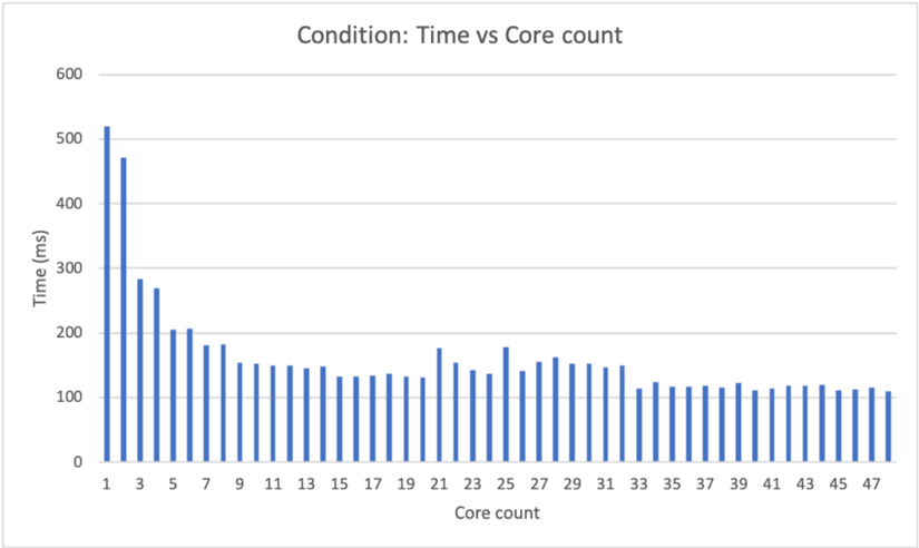
The image displays a vertical bar chart titled "Condition: Time vs Core count." It plots the relationship between the number of processing cores (x-axis) and the time taken for a task in milliseconds (y-axis). The chart demonstrates a clear inverse relationship where increasing the core count generally reduces the execution time, with the most significant gains occurring at lower core counts.
### Components/Axes
* **Title:** "Condition: Time vs Core count" (centered at the top).
* **Y-Axis:**
* **Label:** "Time (ms)" (rotated vertically on the left side).
* **Scale:** Linear scale from 0 to 600 ms.
* **Major Gridlines:** Horizontal lines at 0, 100, 200, 300, 400, 500, and 600 ms.
* **X-Axis:**
* **Label:** "Core count" (centered at the bottom).
* **Scale:** Discrete integer values from 1 to 47.
* **Tick Marks:** Labeled at odd numbers (1, 3, 5, ..., 47). Bars exist for all integer values between 1 and 47.
* **Data Series:** A single series represented by blue vertical bars. There is no legend, as only one data category is plotted.
* **Spatial Layout:** The chart area is bounded by the axes. The title is positioned above the plot area. Axis labels are placed outside the plot area, to the left and below.
### Detailed Analysis
The chart shows the time (in ms) for 47 different core count configurations. The trend is a steep initial decline followed by a plateau.
**Trend Verification:** The data series exhibits a sharp downward slope from core count 1 to approximately 9, after which the slope becomes much shallower, indicating diminishing returns. The line of best fit through the bar tops would be a decaying curve.
**Approximate Data Points (Key Values):**
* **Core 1:** ~520 ms (Highest value)
* **Core 2:** ~470 ms
* **Core 3:** ~280 ms
* **Core 4:** ~270 ms
* **Core 5:** ~205 ms
* **Core 6:** ~205 ms
* **Core 7:** ~180 ms
* **Core 8:** ~180 ms
* **Core 9:** ~150 ms (The point where the rate of decrease slows significantly)
* **Core 10-20:** Values fluctuate between approximately 130 ms and 150 ms.
* **Core 21:** ~175 ms (A noticeable local spike)
* **Core 22-24:** Values return to the ~130-150 ms range.
* **Core 25:** ~180 ms (Another local spike, similar to core 21)
* **Core 26-47:** Values stabilize in a narrow band, mostly between ~110 ms and ~130 ms, with very minor fluctuations. The final bar (Core 47) is approximately 110 ms.
### Key Observations
1. **Diminishing Returns:** The performance benefit (reduction in time) per added core is massive when moving from 1 to 3 cores, becomes moderate from 3 to 9 cores, and becomes minimal beyond 9 cores.
2. **Performance Plateau:** After approximately 9 cores, the execution time enters a plateau region, hovering around 110-150 ms. Adding more cores beyond this point yields negligible improvement.
3. **Anomalous Spikes:** There are two distinct, isolated increases in time at core counts 21 and 25. These break the general downward/flat trend and may indicate specific system overhead, resource contention, or an artifact of the test condition at those particular configurations.
4. **Stability at High Core Counts:** From core count 33 onward, the time values are remarkably consistent, showing very little variance.
### Interpretation
This chart illustrates a classic case of parallel scaling with strong diminishing returns. The data suggests the task being measured has a significant serial component (as per Amdahl's Law), which limits the maximum possible speedup regardless of core count.
* **What the data suggests:** The task can be effectively parallelized to a point. The initial steep drop indicates a large parallelizable portion. The plateau suggests that after ~9 cores, the serial bottleneck dominates, and adding more cores provides little to no benefit. The spikes at cores 21 and 25 are outliers that warrant investigation—they could be due to non-uniform memory access (NUMA) effects, OS scheduling anomalies, or specific hardware topology at those core counts.
* **How elements relate:** The x-axis (resource) directly influences the y-axis (performance metric). The relationship is non-linear. The title "Condition" implies this chart represents one specific test scenario; other conditions (e.g., different problem sizes or algorithms) would likely produce different curves.
* **Notable conclusion:** For this specific condition, provisioning more than 9-10 cores for this task is inefficient from a cost-performance perspective. The optimal resource allocation is in the range where the curve begins to flatten. The anomalies at 21 and 25 cores are critical for a systems engineer to diagnose, as they represent points of reduced efficiency.