## Bar Chart: Condition: Time vs Core count
### Overview
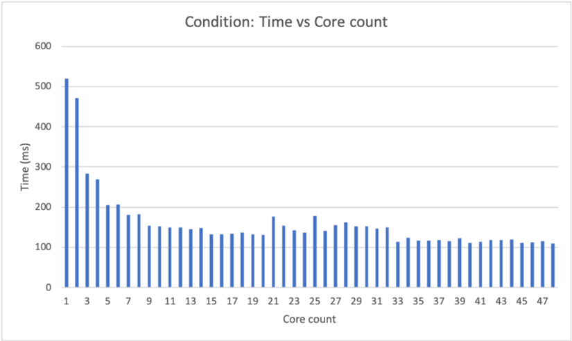
The bar chart displays the relationship between time (in milliseconds) and the core count of a system under a specific condition. The x-axis represents the core count, ranging from 1 to 47, while the y-axis represents the time taken, ranging from 0 to 600 milliseconds.
### Components/Axes
- **Title**: Condition: Time vs Core count
- **X-axis**: Core count, with values ranging from 1 to 47
- **Y-axis**: Time (ms), with values ranging from 0 to 600 milliseconds
- **Legend**: No legend is present in the image
### Detailed Analysis or ### Content Details
The chart shows a clear trend where the time taken increases as the core count increases. The highest time recorded is approximately 500 milliseconds, which corresponds to a core count of 1. The time then decreases as the core count increases, reaching a minimum of around 100 milliseconds at a core count of 47.
### Key Observations
- The time taken increases with the core count, indicating that more cores may lead to longer processing times.
- There is a significant increase in time at a core count of 1, which could be due to the overhead of managing multiple cores.
- The time then decreases as the core count increases, suggesting that adding more cores can improve performance.
### Interpretation
The data suggests that the system's performance is influenced by the number of cores used. With a single core, the system takes the longest time to complete tasks, likely due to the overhead of managing a single core. As the number of cores increases, the time taken decreases, indicating improved performance. This trend is consistent with the concept of parallel processing, where multiple cores can work together to complete tasks faster than a single core. However, there is a point of diminishing returns, where adding more cores does not significantly improve performance, as seen at a core count of 47. This could be due to the complexity of the tasks being performed or the limitations of the system's architecture.