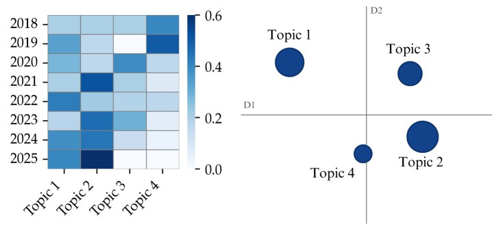
## Chart Type: Heatmap and Scatter Plot
### Overview
The image presents two charts side-by-side. On the left, there's a heatmap showing the relationship between years (2018-2025) and topics (Topic 1 to Topic 4). The color intensity represents the strength of the relationship, ranging from light blue (low) to dark blue (high). On the right, there's a scatter plot showing the relative positions of the four topics on a two-dimensional plane defined by axes D1 and D2. The size of the data point (circle) represents an additional dimension of information.
### Components/Axes
**Heatmap (Left)**
* **Y-axis:** Years (2018, 2019, 2020, 2021, 2022, 2023, 2024, 2025)
* **X-axis:** Topics (Topic 1, Topic 2, Topic 3, Topic 4)
* **Color Scale:** Ranges from 0.0 (light blue) to 0.6 (dark blue)
**Scatter Plot (Right)**
* **X-axis:** D1
* **Y-axis:** D2
* **Data Points:** Topic 1, Topic 2, Topic 3, Topic 4. The size of the circle represents a value.
### Detailed Analysis
**Heatmap Data:**
* **2018:**
* Topic 1: Light blue (approx. 0.2)
* Topic 2: Light blue (approx. 0.2)
* Topic 3: Light blue (approx. 0.2)
* Topic 4: Light blue (approx. 0.2)
* **2019:**
* Topic 1: Light blue (approx. 0.2)
* Topic 2: Light blue (approx. 0.2)
* Topic 3: Light blue (approx. 0.2)
* Topic 4: Dark blue (approx. 0.5)
* **2020:**
* Topic 1: Light blue (approx. 0.2)
* Topic 2: Light blue (approx. 0.2)
* Topic 3: Medium blue (approx. 0.3)
* Topic 4: Light blue (approx. 0.2)
* **2021:**
* Topic 1: Light blue (approx. 0.2)
* Topic 2: Dark blue (approx. 0.5)
* Topic 3: Light blue (approx. 0.2)
* Topic 4: Light blue (approx. 0.2)
* **2022:**
* Topic 1: Medium blue (approx. 0.3)
* Topic 2: Light blue (approx. 0.2)
* Topic 3: Light blue (approx. 0.2)
* Topic 4: Light blue (approx. 0.2)
* **2023:**
* Topic 1: Light blue (approx. 0.2)
* Topic 2: Medium blue (approx. 0.3)
* Topic 3: Light blue (approx. 0.2)
* Topic 4: Light blue (approx. 0.2)
* **2024:**
* Topic 1: Dark blue (approx. 0.5)
* Topic 2: Medium blue (approx. 0.3)
* Topic 3: Light blue (approx. 0.2)
* Topic 4: Light blue (approx. 0.2)
* **2025:**
* Topic 1: Dark blue (approx. 0.5)
* Topic 2: Light blue (approx. 0.2)
* Topic 3: Light blue (approx. 0.2)
* Topic 4: Light blue (approx. 0.2)
**Scatter Plot Data:**
* **Topic 1:** Located in the top-left quadrant, relatively far from both axes. Large circle size.
* **Topic 2:** Located in the bottom-right quadrant, closer to the D1 axis than the D2 axis. Medium circle size.
* **Topic 3:** Located in the top-right quadrant, relatively far from both axes. Medium circle size.
* **Topic 4:** Located in the bottom-left quadrant, close to both axes. Small circle size.
### Key Observations
* The heatmap shows that the relationship between years and topics varies. Some topics have stronger relationships in certain years.
* Topic 4 consistently has a weak relationship across all years.
* The scatter plot shows the relative positions of the topics in a two-dimensional space.
* Topic 1 has the largest circle size, indicating a higher value compared to other topics. Topic 4 has the smallest circle size.
### Interpretation
The heatmap visualizes the strength of association between different topics over time. It suggests that some topics gain or lose relevance in specific years. The scatter plot provides a different perspective, potentially representing the topics' characteristics or features along the D1 and D2 axes. The size of the circles in the scatter plot could represent the overall importance or prevalence of each topic.
The combination of these two charts provides a more comprehensive understanding of the topics. For example, while Topic 4 consistently has a weak relationship in the heatmap, its position in the scatter plot and small circle size further emphasize its relative unimportance or distinct characteristics compared to the other topics. Topic 1, on the other hand, shows a strong relationship in 2024 and 2025 and has the largest circle size, suggesting it is a dominant or significant topic.