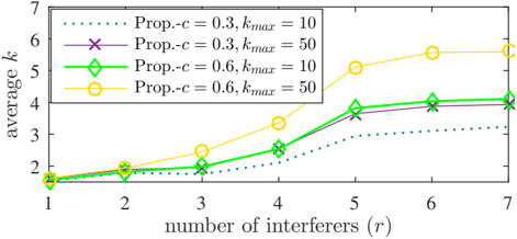
## Line Chart: Average k vs. Number of Interferers
### Overview
The image is a line chart that plots the average value of 'k' against the number of interferers 'r'. There are four data series, each representing a different configuration of parameters 'c' and 'kmax'. The chart aims to show how the average 'k' changes as the number of interferers increases for different parameter settings.
### Components/Axes
* **X-axis:** Number of interferers (r), with values ranging from 1 to 7.
* **Y-axis:** Average k, with values ranging from 1 to 7.
* **Legend (Top-Right):**
* Dotted Blue Line: Prop.-c = 0.3, kmax = 10
* Purple Line with X markers: Prop.-c = 0.3, kmax = 50
* Green Line with Diamond markers: Prop.-c = 0.6, kmax = 10
* Yellow Line with Circle markers: Prop.-c = 0.6, kmax = 50
### Detailed Analysis
* **Prop.-c = 0.3, kmax = 10 (Dotted Blue Line):**
* Trend: Initially increases, then plateaus.
* Data Points:
* r = 1, average k ≈ 1.6
* r = 2, average k ≈ 1.9
* r = 3, average k ≈ 2.0
* r = 4, average k ≈ 2.3
* r = 5, average k ≈ 3.0
* r = 6, average k ≈ 3.2
* r = 7, average k ≈ 3.3
* **Prop.-c = 0.3, kmax = 50 (Purple Line with X markers):**
* Trend: Increases and then plateaus.
* Data Points:
* r = 1, average k ≈ 1.6
* r = 2, average k ≈ 1.9
* r = 3, average k ≈ 2.0
* r = 4, average k ≈ 2.5
* r = 5, average k ≈ 3.8
* r = 6, average k ≈ 3.9
* r = 7, average k ≈ 3.9
* **Prop.-c = 0.6, kmax = 10 (Green Line with Diamond markers):**
* Trend: Increases and then plateaus.
* Data Points:
* r = 1, average k ≈ 1.6
* r = 2, average k ≈ 1.9
* r = 3, average k ≈ 2.0
* r = 4, average k ≈ 2.6
* r = 5, average k ≈ 3.7
* r = 6, average k ≈ 4.1
* r = 7, average k ≈ 4.1
* **Prop.-c = 0.6, kmax = 50 (Yellow Line with Circle markers):**
* Trend: Increases significantly and then plateaus at a higher level.
* Data Points:
* r = 1, average k ≈ 1.6
* r = 2, average k ≈ 1.9
* r = 3, average k ≈ 2.4
* r = 4, average k ≈ 3.4
* r = 5, average k ≈ 5.1
* r = 6, average k ≈ 5.7
* r = 7, average k ≈ 5.8
### Key Observations
* For all configurations, the average 'k' generally increases as the number of interferers increases.
* The configuration with Prop.-c = 0.6 and kmax = 50 (Yellow Line) consistently yields the highest average 'k' values.
* The configuration with Prop.-c = 0.3 and kmax = 10 (Dotted Blue Line) consistently yields the lowest average 'k' values.
* The lines for Prop.-c = 0.3, kmax = 50 and Prop.-c = 0.6, kmax = 10 are very close to each other.
### Interpretation
The data suggests that increasing the parameter 'c' from 0.3 to 0.6 and increasing 'kmax' from 10 to 50 generally leads to a higher average 'k' value, especially as the number of interferers increases. The parameter 'kmax' seems to have a more significant impact on the average 'k' when 'c' is higher (0.6). The plateauing of the lines indicates that beyond a certain number of interferers, the average 'k' value stabilizes for each configuration. The closeness of the purple and green lines suggests that the impact of 'c' is less significant when 'kmax' is not at its maximum value.