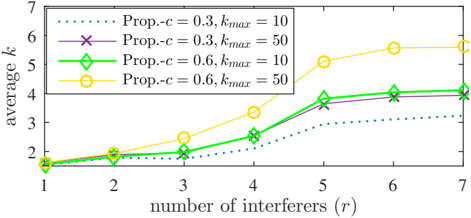
## Chart: Average k vs. Number of Interferers
### Overview
The image presents a line chart illustrating the relationship between the average value of 'k' and the number of interferers ('r') under different parameter settings. The chart compares four different configurations defined by 'Prop-c' (Proportion-c) and 'kmax' (maximum k).
### Components/Axes
* **X-axis:** "number of interferers (r)", ranging from 1 to 7, with tick marks at each integer value.
* **Y-axis:** "average k", ranging from 1 to 7, with tick marks at each integer value.
* **Legend:** Located at the top-center of the chart, defining the four data series:
* Dotted Blue Line: "Prop-c = 0.3, kmax = 10"
* Purple Cross Line: "Prop-c = 0.3, kmax = 50"
* Green Diamond Line: "Prop-c = 0.6, kmax = 10"
* Yellow Circle Line: "Prop-c = 0.6, kmax = 50"
### Detailed Analysis
Here's a breakdown of each data series, with approximate values read from the chart:
1. **Prop-c = 0.3, kmax = 10 (Dotted Blue Line):** This line shows a generally increasing trend, but with diminishing returns.
* r = 1: k ≈ 1.8
* r = 2: k ≈ 2.1
* r = 3: k ≈ 2.4
* r = 4: k ≈ 2.7
* r = 5: k ≈ 3.0
* r = 6: k ≈ 3.2
* r = 7: k ≈ 3.3
2. **Prop-c = 0.3, kmax = 50 (Purple Cross Line):** This line exhibits a more pronounced increase initially, then plateaus.
* r = 1: k ≈ 1.9
* r = 2: k ≈ 2.2
* r = 3: k ≈ 2.7
* r = 4: k ≈ 3.4
* r = 5: k ≈ 3.9
* r = 6: k ≈ 4.0
* r = 7: k ≈ 4.0
3. **Prop-c = 0.6, kmax = 10 (Green Diamond Line):** This line shows a moderate increase, similar to the first series, but starting from a slightly higher initial value.
* r = 1: k ≈ 2.0
* r = 2: k ≈ 2.2
* r = 3: k ≈ 2.5
* r = 4: k ≈ 2.9
* r = 5: k ≈ 3.4
* r = 6: k ≈ 3.7
* r = 7: k ≈ 3.8
4. **Prop-c = 0.6, kmax = 50 (Yellow Circle Line):** This line demonstrates the most significant increase, with a steep slope initially, followed by a leveling off.
* r = 1: k ≈ 2.0
* r = 2: k ≈ 2.4
* r = 3: k ≈ 3.0
* r = 4: k ≈ 3.7
* r = 5: k ≈ 5.0
* r = 6: k ≈ 5.5
* r = 7: k ≈ 5.6
### Key Observations
* Increasing 'kmax' from 10 to 50 generally leads to higher average 'k' values, especially for larger numbers of interferers.
* Increasing 'Prop-c' from 0.3 to 0.6 also tends to increase average 'k', but the effect is less pronounced than changing 'kmax'.
* The rate of increase in average 'k' diminishes as the number of interferers increases for all configurations.
* The "Prop-c = 0.6, kmax = 50" configuration consistently yields the highest average 'k' values across all numbers of interferers.
### Interpretation
The chart suggests that the average value of 'k' is positively correlated with both the proportion 'c' and the maximum value 'kmax'. The number of interferers also has a positive impact on 'k', but this impact becomes less significant as the number of interferers grows.
The parameter 'kmax' appears to have a more substantial influence on 'k' than 'Prop-c'. This could indicate that the maximum allowed value of 'k' is a more critical factor in determining the average 'k' in this system.
The diminishing returns observed with increasing interferers suggest that there's a saturation point beyond which adding more interferers doesn't significantly increase 'k'. This could be due to limitations in the system's capacity to handle interference or the emergence of other factors that counteract the effect of additional interferers.
The chart provides insights into the behavior of a system where 'k' represents some measure of performance or efficiency, and 'r' represents the level of interference. Understanding the relationship between these variables can help optimize system parameters to achieve desired performance levels in the presence of interference.