## Line Graph: Average k vs. Number of Interferers (r)
### Overview
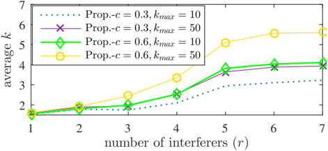
The graph illustrates the relationship between the average value of a variable "k" and the number of interferers (r) under different parameter configurations. Four distinct data series are plotted, each representing unique combinations of "Prop.-c" (proportionality constant) and "k_max" (maximum k value). The y-axis (average k) ranges from 1 to 7, while the x-axis (number of interferers) spans 1 to 7.
### Components/Axes
- **X-axis**: Number of interferers (r), labeled with integer values 1–7.
- **Y-axis**: Average k, labeled with integer values 1–7.
- **Legend**:
- Dotted line (blue): Prop.-c = 0.3, k_max = 10
- Purple crosses: Prop.-c = 0.3, k_max = 50
- Green diamonds: Prop.-c = 0.6, k_max = 10
- Yellow circles: Prop.-c = 0.6, k_max = 50
- **Legend Position**: Top-left corner, outside the plot area.
### Detailed Analysis
1. **Dotted Line (Prop.-c = 0.3, k_max = 10)**:
- Starts at ~1.8 (r=1) and increases gradually to ~3.2 (r=7).
- Slope: Gentle upward trend.
- Data Points:
- r=1: ~1.8
- r=2: ~1.9
- r=3: ~2.1
- r=4: ~2.3
- r=5: ~2.5
- r=6: ~2.7
- r=7: ~3.2
2. **Purple Crosses (Prop.-c = 0.3, k_max = 50)**:
- Starts at ~1.9 (r=1) and rises to ~4.0 (r=7).
- Slope: Moderate upward trend.
- Data Points:
- r=1: ~1.9
- r=2: ~2.1
- r=3: ~2.4
- r=4: ~2.8
- r=5: ~3.3
- r=6: ~3.7
- r=7: ~4.0
3. **Green Diamonds (Prop.-c = 0.6, k_max = 10)**:
- Starts at ~1.8 (r=1) and increases to ~4.2 (r=7).
- Slope: Steeper than purple crosses.
- Data Points:
- r=1: ~1.8
- r=2: ~2.0
- r=3: ~2.3
- r=4: ~2.7
- r=5: ~3.2
- r=6: ~3.6
- r=7: ~4.2
4. **Yellow Circles (Prop.-c = 0.6, k_max = 50)**:
- Starts at ~1.8 (r=1) and rises sharply to ~6.5 (r=7).
- Slope: Steepest upward trend.
- Data Points:
- r=1: ~1.8
- r=2: ~2.2
- r=3: ~2.7
- r=4: ~3.5
- r=5: ~4.8
- r=6: ~5.5
- r=7: ~6.5
### Key Observations
- **Parameter Impact**: Higher values of both Prop.-c and k_max correlate with higher average k. For example:
- At r=7, yellow circles (Prop.-c=0.6, k_max=50) reach ~6.5, while dotted lines (Prop.-c=0.3, k_max=10) only reach ~3.2.
- **Slope Differences**: The yellow circles (highest parameters) exhibit the steepest slope, indicating a nonlinear relationship between r and k for larger parameter values.
- **Convergence**: All lines start at similar values (~1.8–1.9) for r=1, suggesting baseline behavior is independent of parameters.
### Interpretation
The graph demonstrates that:
1. **Parameter Sensitivity**: Both Prop.-c and k_max significantly influence the system's response to interferers. Higher values amplify the effect of increasing interferers on average k.
2. **Threshold Behavior**: For larger k_max (e.g., 50), the system exhibits a more pronounced response to interferers, suggesting a threshold effect where performance scales rapidly beyond a critical number of interferers.
3. **Nonlinearity**: The steepest slope for yellow circles (Prop.-c=0.6, k_max=50) implies diminishing returns or saturation at higher r values, as the curve flattens near r=7.
This analysis highlights the importance of parameter tuning in systems affected by interference, where optimal performance depends on balancing Prop.-c and k_max to manage trade-offs between responsiveness and stability.