## Scatter Plot: EFE2 Model with Data Series and Outliers
### Overview
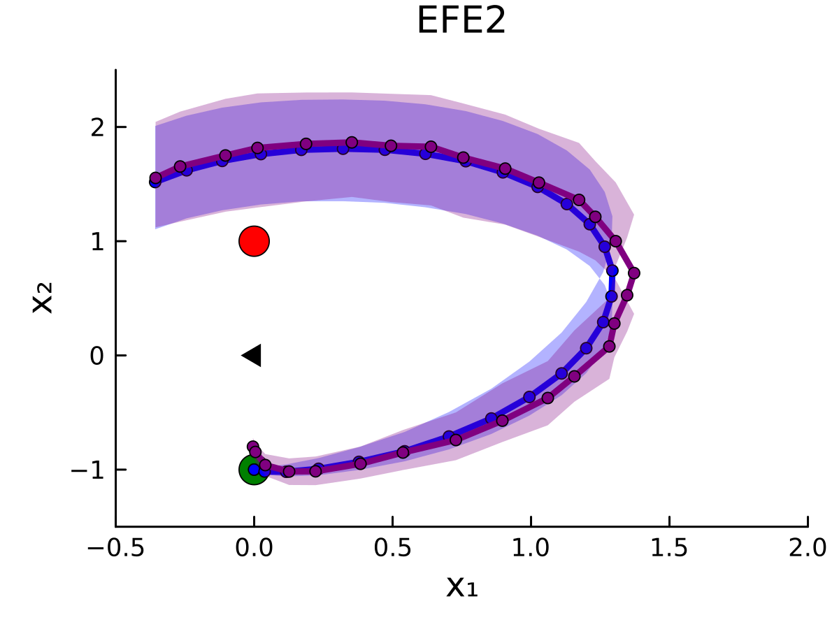
The image depicts a scatter plot titled "EFE2," showing two primary data series: a curved blue line with purple shading and a red circular outlier. A green circular data point and a black triangular marker are also present. The plot explores the relationship between variables **X1** (horizontal axis) and **X2** (vertical axis), with the blue line representing a modeled trend and the red point indicating an outlier.
---
### Components/Axes
- **Axes Labels**:
- **X1**: Horizontal axis, ranging from **-0.5 to 2.0**.
- **X2**: Vertical axis, ranging from **-1 to 2**.
- **Legend**:
- **Top-left corner**:
- **Blue line with purple shading**: Labeled "EFE2" (model trend).
- **Red circle**: Labeled "Outlier."
- **Data Points**:
- **Green circle**: Located at **(0, -1)**.
- **Red circle**: Located at **(0, 1)**.
- **Black triangle**: Positioned near **(0, -0.5)**.
---
### Detailed Analysis
1. **Blue Line (EFE2 Model)**:
- The blue line forms a **U-shaped curve** starting near **(-0.5, -1)**, peaking at approximately **(1.5, 1.5)**, and ending at **(2.0, 0)**.
- The **purple shading** around the line suggests a confidence interval or variability in the model's predictions.
- Data points along the line are evenly spaced, with **X1** values increasing from **-0.5 to 2.0** and **X2** values following the curve.
2. **Red Outlier**:
- A single red circular data point is located at **(0, 1)**, far above the blue line’s trajectory at **X1 = 0**.
- This point deviates significantly from the modeled trend, confirming its classification as an outlier.
3. **Green Data Point**:
- A green circle is positioned at **(0, -1)**, aligning with the lower end of the blue line’s curve.
4. **Black Triangle**:
- A black triangular marker is placed near **(0, -0.5)**, slightly above the green point. Its purpose is unclear but may indicate a directional trend or additional category.
---
### Key Observations
- The **U-shaped blue line** suggests a non-linear relationship between **X1** and **X2**, with a minimum at **X1 ≈ -0.5** and a maximum at **X1 ≈ 1.5**.
- The **red outlier** at **(0, 1)** is the only point outside the blue line’s shaded confidence interval, indicating potential anomalies or measurement errors.
- The **green point** at **(0, -1)** aligns with the model’s lower boundary, possibly serving as a reference or boundary condition.
- The **black triangle** near **(0, -0.5)** introduces ambiguity, as it is not labeled or explained in the legend.
---
### Interpretation
- The **EFE2 model** (blue line) demonstrates a parabolic relationship between **X1** and **X2**, with the shaded region highlighting uncertainty or variability in predictions.
- The **red outlier** at **(0, 1)** challenges the model’s accuracy at this specific **X1** value, suggesting either an exceptional case or a need for model refinement.
- The **green point** at **(0, -1)** may represent a boundary condition or starting point for the model’s behavior.
- The **black triangle**’s placement near **(0, -0.5)** could imply a directional trend (e.g., movement toward the origin) or an unclassified data category.
This visualization emphasizes the importance of contextualizing outliers and validating model assumptions in non-linear systems. The EFE2 model’s U-shape suggests diminishing returns or thresholds in the relationship between **X1** and **X2**, while the outlier underscores the need for robust error handling in predictive frameworks.