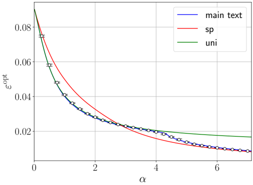
## Line Chart: Optimal Error vs. Alpha
### Overview
The image presents a line chart illustrating the relationship between the optimal error (εopt) and a parameter alpha (α). Three different lines represent different conditions or models: "main text", "sp", and "uni". The chart displays how the optimal error changes as alpha varies from approximately 0 to 7.
### Components/Axes
* **X-axis:** Labeled "α" (alpha). Scale ranges from 0 to 7, with tick marks at intervals of 1.
* **Y-axis:** Labeled "εopt" (optimal error). Scale ranges from 0 to 0.09, with tick marks at intervals of 0.02.
* **Legend:** Located in the top-right corner. Contains the following labels with corresponding colors:
* "main text" - Blue
* "sp" - Red
* "uni" - Green
* **Data Series:** Three lines representing the relationship between α and εopt for each condition. Each line is marked with circular data points, with error bars.
### Detailed Analysis
* **"main text" (Blue Line):** The blue line slopes downward, indicating that as alpha increases, the optimal error decreases.
* At α ≈ 0, εopt ≈ 0.08.
* At α ≈ 1, εopt ≈ 0.05.
* At α ≈ 2, εopt ≈ 0.04.
* At α ≈ 3, εopt ≈ 0.03.
* At α ≈ 4, εopt ≈ 0.025.
* At α ≈ 5, εopt ≈ 0.02.
* At α ≈ 6, εopt ≈ 0.017.
* At α ≈ 7, εopt ≈ 0.015.
* **"sp" (Red Line):** The red line also slopes downward, but is initially above the blue line. It appears to converge towards the blue line as alpha increases.
* At α ≈ 0, εopt ≈ 0.075.
* At α ≈ 1, εopt ≈ 0.055.
* At α ≈ 2, εopt ≈ 0.04.
* At α ≈ 3, εopt ≈ 0.03.
* At α ≈ 4, εopt ≈ 0.025.
* At α ≈ 5, εopt ≈ 0.02.
* At α ≈ 6, εopt ≈ 0.018.
* At α ≈ 7, εopt ≈ 0.016.
* **"uni" (Green Line):** The green line is relatively flat compared to the other two lines. It starts above the blue and red lines and remains higher as alpha increases.
* At α ≈ 0, εopt ≈ 0.085.
* At α ≈ 1, εopt ≈ 0.07.
* At α ≈ 2, εopt ≈ 0.055.
* At α ≈ 3, εopt ≈ 0.04.
* At α ≈ 4, εopt ≈ 0.03.
* At α ≈ 5, εopt ≈ 0.025.
* At α ≈ 6, εopt ≈ 0.022.
* At α ≈ 7, εopt ≈ 0.02.
### Key Observations
* All three lines demonstrate a decreasing trend, indicating that increasing alpha generally reduces the optimal error.
* The "sp" line initially has a higher optimal error than the "main text" line, but they converge as alpha increases.
* The "uni" line consistently exhibits the highest optimal error across all values of alpha.
* The error bars indicate some uncertainty in the data points.
### Interpretation
The chart suggests that the optimal error is sensitive to the value of alpha. The "main text" model appears to perform best, achieving the lowest optimal error for most values of alpha. The "sp" model shows improvement as alpha increases, potentially converging to the performance of the "main text" model at higher alpha values. The "uni" model consistently underperforms compared to the other two, indicating that it may not be well-suited for this particular problem or dataset. The convergence of the "sp" and "main text" lines suggests that the difference between these two models diminishes as alpha increases, potentially indicating that they are capturing similar underlying relationships. The error bars suggest that the observed differences between the models may not always be statistically significant. The chart provides insights into the optimal parameter settings for these models and highlights the importance of considering the choice of model when minimizing error.