## Line Chart: Optimal Error (ε_opt) vs. Parameter α
### Overview
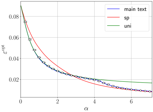
This image is a line chart plotting the optimal error, denoted as ε_opt (epsilon opt), against a parameter α (alpha). It displays three data series, showing how ε_opt decreases as α increases. The chart includes a legend, labeled axes, and grid lines for reference.
### Components/Axes
* **X-Axis (Horizontal):**
* **Label:** α (alpha)
* **Scale:** Linear scale ranging from 0 to approximately 7.
* **Major Tick Marks:** Located at 0, 2, 4, 6.
* **Y-Axis (Vertical):**
* **Label:** ε_opt (epsilon opt)
* **Scale:** Linear scale ranging from 0.00 to approximately 0.09.
* **Major Tick Marks:** Located at 0.00, 0.02, 0.04, 0.06, 0.08.
* **Legend:**
* **Position:** Top-right corner of the chart area.
* **Entries:**
1. **Blue line:** "main text"
2. **Red line:** "sp"
3. **Green line:** "uni"
* **Grid:** A light gray grid is present, with vertical lines at each major x-axis tick and horizontal lines at each major y-axis tick.
### Detailed Analysis
**Trend Verification & Data Points:**
All three series exhibit a decaying trend, where ε_opt decreases monotonically as α increases. The rate of decay slows for larger α values.
1. **"main text" (Blue Line with Error Bars):**
* **Trend:** Starts at the highest point among the three at α=0 and shows a steep initial decline, which gradually flattens. It is the only series with visible error bars.
* **Approximate Data Points (ε_opt vs. α):**
* α ≈ 0.0, ε_opt ≈ 0.080
* α ≈ 0.5, ε_opt ≈ 0.058
* α ≈ 1.0, ε_opt ≈ 0.042
* α ≈ 2.0, ε_opt ≈ 0.028
* α ≈ 3.0, ε_opt ≈ 0.022
* α ≈ 4.0, ε_opt ≈ 0.019
* α ≈ 5.0, ε_opt ≈ 0.016
* α ≈ 6.0, ε_opt ≈ 0.013
* α ≈ 7.0, ε_opt ≈ 0.010
* **Error Bars:** Vertical error bars are present at each data point, indicating variability or uncertainty in the ε_opt measurement. The bars appear relatively consistent in size across the α range.
2. **"sp" (Red Line):**
* **Trend:** Starts slightly above the blue line at α=0. It decays more slowly than the blue line initially but crosses below it at approximately α ≈ 3.5. It continues to decay and ends at the lowest ε_opt value among the three series at α=7.
* **Approximate Key Points:**
* α = 0.0, ε_opt ≈ 0.085 (estimated start, slightly above blue)
* Crosses below the blue line at α ≈ 3.5, ε_opt ≈ 0.020.
* α = 7.0, ε_opt ≈ 0.008 (estimated end, below blue).
3. **"uni" (Green Line):**
* **Trend:** Starts below the red line but above the blue line at α=0. It decays at a rate between the other two lines. It remains above the blue line for the entire plotted range and appears to asymptotically approach a value higher than the other two series.
* **Approximate Key Points:**
* α = 0.0, ε_opt ≈ 0.082 (estimated start, between red and blue).
* α = 7.0, ε_opt ≈ 0.018 (estimated end, above both red and blue lines). It maintains a clear gap above the blue line, especially for α > 4.
### Key Observations
1. **Inverse Relationship:** All series demonstrate a clear inverse relationship between α and ε_opt. Increasing α leads to a lower optimal error.
2. **Convergence and Crossover:** The "sp" (red) and "main text" (blue) lines converge and cross at α ≈ 3.5. After this point, "sp" yields a lower ε_opt.
3. **Asymptotic Behavior:** The "uni" (green) line shows the slowest decay at high α and appears to level off at a higher ε_opt value (~0.018 at α=7) compared to the other two series (~0.010 and ~0.008).
4. **Uncertainty Quantification:** Only the "main text" series includes error bars, suggesting its data points are derived from a process with measured or calculated variance, while the "sp" and "uni" lines may represent theoretical bounds or results from a deterministic model.
### Interpretation
This chart likely compares the performance of three different methods, models, or approximations ("main text", "sp", "uni") in minimizing an error metric (ε_opt) as a function of a tuning or complexity parameter (α).
* **The "main text" method** appears to be the primary subject of analysis, given its name and the inclusion of error bars. It performs well, especially at low α, but is outperformed by the "sp" method at higher α values (α > 3.5).
* **The "sp" method** shows a crossover behavior. It is less effective than "main text" for small α but becomes the most effective (lowest ε_opt) for larger α. This suggests it may be a more suitable approach when the parameter α can be set high.
* **The "uni" method** consistently underperforms the other two for α > ~1.5. Its higher asymptotic error suggests it may be a simpler or more constrained model that cannot achieve the same level of error reduction as the others, regardless of how large α becomes.
* **Overall Implication:** The choice of optimal method depends on the operational range of α. There is no single best method across all α. The presence of error bars only on "main text" warrants caution when directly comparing its precise values to the smooth curves of the other two, as the true value of "main text" at any α lies within a range. The chart effectively argues for the superiority of "sp" in high-α regimes and highlights the limitations of the "uni" approach.