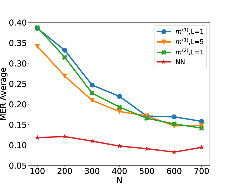
## Line Chart: MER Average vs. N for Different Models
### Overview
This image is a line chart displaying the "MER Average" on the y-axis against "N" on the x-axis. Four different data series are plotted, each representing a different model or configuration, indicated by distinct colors and markers. The chart shows how the MER Average changes as N increases for each of these series.
### Components/Axes
* **Y-axis Title**: MER Average
* **Scale**: Linear, ranging from 0.05 to 0.40.
* **Tick Marks**: 0.05, 0.10, 0.15, 0.20, 0.25, 0.30, 0.35, 0.40.
* **X-axis Title**: N
* **Scale**: Linear, ranging from 100 to 700.
* **Tick Marks**: 100, 200, 300, 400, 500, 600, 700.
* **Legend**: Located in the top-right quadrant of the chart.
* **Blue circles with solid line**: $m^{(1)}, L=1$
* **Orange triangles with solid line**: $m^{(1)}, L=5$
* **Green crosses with solid line**: $m^{(2)}, L=1$
* **Red stars with solid line**: NN
### Detailed Analysis
**Data Series: $m^{(1)}, L=1$ (Blue circles)**
* **Trend**: This data series starts at a high MER Average and generally slopes downward as N increases.
* **Data Points (approximate)**:
* N=100: 0.39
* N=200: 0.33
* N=300: 0.25
* N=400: 0.22
* N=500: 0.17
* N=600: 0.16
* N=700: 0.155
**Data Series: $m^{(1)}, L=5$ (Orange triangles)**
* **Trend**: This data series also starts at a high MER Average and slopes downward as N increases, generally staying below the $m^{(1)}, L=1$ series for N > 200.
* **Data Points (approximate)**:
* N=100: 0.345
* N=200: 0.27
* N=300: 0.225
* N=400: 0.19
* N=500: 0.165
* N=600: 0.15
* N=700: 0.155
**Data Series: $m^{(2)}, L=1$ (Green crosses)**
* **Trend**: This data series starts at the highest MER Average and slopes downward as N increases, closely tracking the $m^{(1)}, L=1$ series for N > 300.
* **Data Points (approximate)**:
* N=100: 0.39
* N=200: 0.32
* N=300: 0.23
* N=400: 0.175
* N=500: 0.165
* N=600: 0.15
* N=700: 0.145
**Data Series: NN (Red stars)**
* **Trend**: This data series starts at the lowest MER Average and shows a generally downward trend, with a slight increase at the end. It consistently remains below the other three series.
* **Data Points (approximate)**:
* N=100: 0.12
* N=200: 0.115
* N=300: 0.105
* N=400: 0.095
* N=500: 0.09
* N=600: 0.085
* N=700: 0.095
### Key Observations
* All four data series exhibit a decreasing trend in MER Average as N increases, suggesting that performance generally improves with a larger value of N for all tested models.
* The "NN" series consistently shows the lowest MER Average across all values of N, indicating it is the most performant model among those plotted.
* The $m^{(1)}, L=1$ and $m^{(2)}, L=1$ series are very close in performance, especially for N values of 300 and above.
* The $m^{(1)}, L=5$ series performs worse than $m^{(1)}, L=1$ for N values up to 600, but converges at N=700.
* The initial MER Average at N=100 for $m^{(1)}, L=1$ and $m^{(2)}, L=1$ is approximately 0.39, which is the highest observed value.
### Interpretation
The chart demonstrates the relationship between a parameter "N" and the "MER Average" for four different models or configurations. The consistent downward trend across all series indicates that increasing "N" leads to a reduction in the MER Average, which is likely a desirable outcome, implying improved performance or accuracy.
The "NN" model stands out as the most effective, achieving the lowest MER Average throughout the observed range of N. This suggests that the neural network approach is superior in this context compared to the other models represented by $m^{(1)}$ and $m^{(2)}$.
The close proximity of $m^{(1)}, L=1$ and $m^{(2)}, L=1$ suggests that for these specific configurations, the difference in performance is minimal, particularly as N grows. The comparison between $m^{(1)}, L=1$ and $m^{(1)}, L=5$ indicates that a smaller value of L (i.e., L=1) is more beneficial for the $m^{(1)}$ model when N is not excessively large. However, at N=700, their performance becomes comparable.
This data could be used to inform model selection and parameter tuning. For instance, if the goal is to minimize MER Average, the "NN" model would be the preferred choice. If computational resources or other constraints limit the maximum value of N, the chart provides insights into the expected MER Average for each model at different N values, allowing for a trade-off analysis between performance and resource utilization. The convergence of some lines at higher N values might suggest a saturation point in performance improvement for those models.