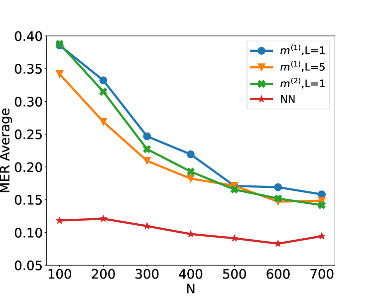
## Line Chart: MER Average vs. N
### Overview
This image presents a line chart illustrating the relationship between 'N' (likely a sample size or number of iterations) and the 'MER Average' (likely a metric for error rate). Four different data series are plotted, each representing a different configuration or model.
### Components/Axes
* **X-axis:** Labeled "N", with values ranging from 100 to 700, incrementing by 100.
* **Y-axis:** Labeled "MER Average", with values ranging from 0.05 to 0.40, incrementing by 0.05.
* **Legend:** Located in the top-right corner, containing the following labels and corresponding colors:
* `m(1), L=1` (Blue)
* `m(1), L=5` (Orange)
* `m(2), L=1` (Green)
* `NN` (Red)
### Detailed Analysis
Let's analyze each line individually, noting trends and approximate data points.
* **`m(1), L=1` (Blue Line):** This line starts at approximately 0.38 at N=100 and slopes downward, reaching approximately 0.16 at N=700. Data points (approximate): (100, 0.38), (200, 0.32), (300, 0.27), (400, 0.22), (500, 0.19), (600, 0.17), (700, 0.16).
* **`m(1), L=5` (Orange Line):** This line begins at approximately 0.34 at N=100 and decreases more rapidly than the blue line initially, reaching approximately 0.17 at N=700. Data points (approximate): (100, 0.34), (200, 0.28), (300, 0.23), (400, 0.19), (500, 0.17), (600, 0.17), (700, 0.17).
* **`m(2), L=1` (Green Line):** This line starts at approximately 0.39 at N=100 and decreases, similar to the blue line, reaching approximately 0.15 at N=700. Data points (approximate): (100, 0.39), (200, 0.33), (300, 0.26), (400, 0.20), (500, 0.17), (600, 0.16), (700, 0.15).
* **`NN` (Red Line):** This line is relatively flat, starting at approximately 0.12 at N=100 and decreasing slightly to approximately 0.08 at N=700. Data points (approximate): (100, 0.12), (200, 0.11), (300, 0.10), (400, 0.09), (500, 0.08), (600, 0.07), (700, 0.08).
### Key Observations
* All lines exhibit a decreasing trend, indicating that as 'N' increases, the 'MER Average' generally decreases.
* The `NN` (red) line consistently has the lowest 'MER Average' across all values of 'N'.
* The `m(1), L=1` (blue) and `m(2), L=1` (green) lines are relatively close to each other in terms of 'MER Average'.
* The `m(1), L=5` (orange) line shows a steeper initial decrease compared to the other lines.
* The rate of decrease slows down for all lines as 'N' increases, suggesting diminishing returns.
### Interpretation
The chart demonstrates the impact of increasing 'N' on the 'MER Average' for different model configurations. The 'NN' model consistently outperforms the other models (`m(1)` and `m(2)`) across all values of 'N', suggesting it is more robust or efficient. The parameter 'L' (likely a length or level) seems to influence the initial rate of improvement, as `m(1), L=5` decreases more rapidly at lower values of 'N' than `m(1), L=1`. The diminishing returns observed as 'N' increases suggest that there is a point beyond which increasing 'N' provides minimal improvement in 'MER Average'. The 'MER Average' likely represents some form of error rate, and the goal is to minimize it. The chart suggests that increasing the sample size ('N') and using the 'NN' model are effective strategies for reducing the error rate. The specific meaning of 'm(1)', 'm(2)', and 'L' would require additional context about the models being compared.