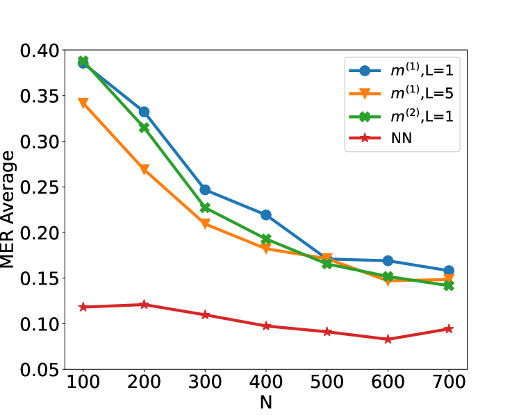
## Line Chart: MER Average vs. N for Different Methods
### Overview
The image is a line chart plotting the "MER Average" (y-axis) against a variable "N" (x-axis) for four different computational methods or models. The chart demonstrates how the average Metric Error Rate (MER) changes as the parameter N increases from 100 to 700.
### Components/Axes
* **X-Axis:** Labeled "N". It has major tick marks at intervals of 100, ranging from 100 to 700.
* **Y-Axis:** Labeled "MER Average". It has major tick marks at intervals of 0.05, ranging from 0.05 to 0.40.
* **Legend:** Located in the top-right corner of the plot area. It contains four entries:
1. Blue line with circle markers: `m^(1), L=1`
2. Orange line with downward-pointing triangle markers: `m^(1), L=5`
3. Green line with 'X' (cross) markers: `m^(2), L=1`
4. Red line with star markers: `NN`
### Detailed Analysis
**Data Series and Trends:**
1. **`m^(1), L=1` (Blue, Circles):**
* **Trend:** Shows a strong, consistent downward slope as N increases.
* **Data Points (Approximate):**
* N=100: ~0.39
* N=200: ~0.33
* N=300: ~0.25
* N=400: ~0.22
* N=500: ~0.17
* N=600: ~0.17
* N=700: ~0.16
2. **`m^(1), L=5` (Orange, Triangles):**
* **Trend:** Also shows a strong downward slope, starting lower than the L=1 variant but converging with it at higher N.
* **Data Points (Approximate):**
* N=100: ~0.34
* N=200: ~0.27
* N=300: ~0.21
* N=400: ~0.18
* N=500: ~0.17
* N=600: ~0.15
* N=700: ~0.15
3. **`m^(2), L=1` (Green, Crosses):**
* **Trend:** Follows a very similar downward trajectory to the blue line (`m^(1), L=1`), but is consistently slightly lower.
* **Data Points (Approximate):**
* N=100: ~0.39 (nearly identical to blue)
* N=200: ~0.32
* N=300: ~0.23
* N=400: ~0.19
* N=500: ~0.16
* N=600: ~0.15
* N=700: ~0.14
4. **`NN` (Red, Stars):**
* **Trend:** Exhibits a very shallow, nearly flat downward trend, remaining significantly lower than the other three series across all values of N.
* **Data Points (Approximate):**
* N=100: ~0.12
* N=200: ~0.12
* N=300: ~0.11
* N=400: ~0.10
* N=500: ~0.09
* N=600: ~0.08
* N=700: ~0.09
### Key Observations
1. **Performance Hierarchy:** The Neural Network (`NN`) method consistently achieves the lowest MER Average across all tested values of N, indicating superior performance in this metric.
2. **Convergence:** The three non-NN methods (`m^(1), L=1`, `m^(1), L=5`, `m^(2), L=1`) start with higher error rates but show significant improvement (decreasing MER) as N increases. Their performance converges to a similar range (approximately 0.14-0.16) at N=700.
3. **Effect of L:** For the `m^(1)` method, using `L=5` (orange) results in a lower initial error rate at N=100 compared to `L=1` (blue), but the advantage diminishes as N grows.
4. **Effect of Model Type:** The `m^(2)` model (green) performs slightly better than the `m^(1)` model (blue) when both use `L=1`, suggesting the `m^(2)` architecture may be more efficient.
5. **Sensitivity to N:** The `NN` model is relatively insensitive to changes in N, while the other models are highly sensitive, showing dramatic improvements with larger N.
### Interpretation
This chart likely compares the performance of different algorithmic or model approaches (variants of a method `m` and a Neural Network `NN`) on a task where `N` represents a key resource or complexity parameter (e.g., number of samples, training iterations, or model size). The "MER Average" is an error metric to be minimized.
The data suggests a fundamental trade-off: The specialized `m` methods require a larger `N` to achieve low error rates, but they do improve predictably with more resources. The `NN` method, in contrast, starts with a much lower error rate and is robust to changes in `N`, implying it may be a more data-efficient or inherently powerful model for this specific task. The convergence of the `m` methods at high `N` indicates a performance ceiling for that class of models under these conditions. The investigation would benefit from knowing what `m`, `L`, and `N` specifically represent to fully contextualize these results.