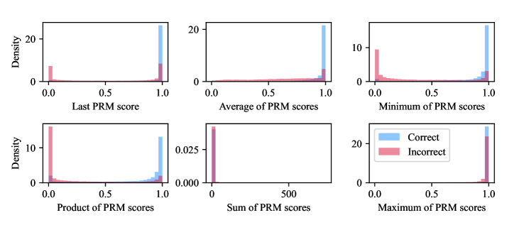
## Histogram Grid: PRM Score Distributions
### Overview
The image presents a grid of six histograms, each displaying the distribution of a different type of PRM (Predicted Residue Masking) score. The histograms compare the distributions of these scores for "Correct" and "Incorrect" predictions, using blue and pink bars respectively. The x-axis represents the PRM score, while the y-axis represents the density or frequency of occurrence.
### Components/Axes
* **Titles:**
* Top-left: "Last PRM score"
* Top-middle: "Average of PRM scores"
* Top-right: "Minimum of PRM scores"
* Bottom-left: "Product of PRM scores"
* Bottom-middle: "Sum of PRM scores"
* Bottom-right: "Maximum of PRM scores"
* **Y-axis:** "Density" (except for the "Sum of PRM scores" plot, which has no label)
* **X-axis:** All x-axes range from 0.0 to 1.0, except for "Sum of PRM scores" which ranges from 0 to 500.
* **Legend:** Located at the bottom-right, indicating "Correct" predictions are represented by blue bars and "Incorrect" predictions by pink bars.
* **Y-axis Scales:**
* Top-left: 0 to 20
* Top-middle: 0 to 20
* Top-right: 0 to 10
* Bottom-left: 0 to 10
* Bottom-middle: 0 to 0.025
* Bottom-right: 0 to 20
### Detailed Analysis
**1. Last PRM Score:**
* **Correct (Blue):** The distribution is heavily skewed towards 1.0, with a high density of correct predictions having a last PRM score close to 1.0.
* **Incorrect (Pink):** The distribution is concentrated near 0.0, indicating that incorrect predictions tend to have a last PRM score close to 0.0.
**2. Average of PRM Scores:**
* **Correct (Blue):** Similar to the "Last PRM score," the distribution is skewed towards 1.0.
* **Incorrect (Pink):** The distribution is concentrated near 0.0.
**3. Minimum of PRM Scores:**
* **Correct (Blue):** Skewed towards 1.0, but with a slightly broader distribution than the "Last" and "Average" scores.
* **Incorrect (Pink):** Concentrated near 0.0.
**4. Product of PRM Scores:**
* **Correct (Blue):** Skewed towards 1.0, but with a broader distribution than the "Last" and "Average" scores.
* **Incorrect (Pink):** Concentrated near 0.0.
**5. Sum of PRM Scores:**
* **Correct (Blue):** The distribution is heavily skewed towards higher values, peaking near 500.
* **Incorrect (Pink):** The distribution is concentrated near 0.
**6. Maximum of PRM Scores:**
* **Correct (Blue):** The distribution is heavily skewed towards 1.0.
* **Incorrect (Pink):** The distribution is concentrated near 0.0.
### Key Observations
* For all PRM score types (Last, Average, Minimum, Product, Maximum), correct predictions tend to have scores close to 1.0, while incorrect predictions tend to have scores close to 0.0.
* The "Sum of PRM scores" plot shows a different x-axis scale (0 to 500) and a different distribution shape, but the general trend of correct predictions having higher scores and incorrect predictions having lower scores remains consistent.
* The "Sum of PRM scores" plot has a different y-axis scale (0 to 0.025) compared to the other plots.
### Interpretation
The histograms demonstrate a clear separation in PRM score distributions between correct and incorrect predictions. This suggests that PRM scores are a strong indicator of prediction accuracy. High PRM scores (close to 1.0 for most metrics, high values for the sum) are associated with correct predictions, while low PRM scores (close to 0.0 for most metrics, low values for the sum) are associated with incorrect predictions. This information could be used to improve prediction models by focusing on increasing PRM scores for correct predictions and decreasing them for incorrect predictions. The "Sum of PRM scores" plot, with its different scale, highlights the cumulative effect of PRM scores, further emphasizing the distinction between correct and incorrect predictions.