\n
## Heatmaps: Spectrogram Comparison
### Overview
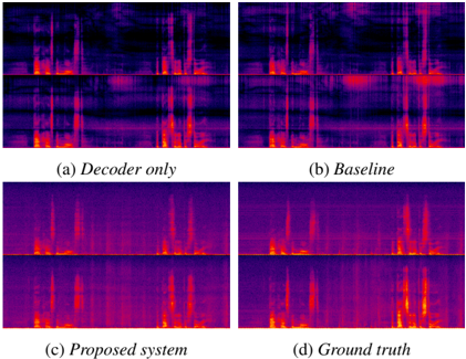
The image presents a 2x2 grid of heatmaps, visually representing spectrograms. Each heatmap is labeled with a different system or condition: (a) Decoder only, (b) Baseline, (c) Proposed system, and (d) Ground truth. The heatmaps appear to visualize the frequency content of a signal over time, with color intensity representing amplitude or energy. The vertical axis likely represents frequency, and the horizontal axis represents time.
### Components/Axes
The image does not explicitly label the axes. However, based on the visual characteristics of spectrograms, we can infer:
* **X-axis:** Time (likely in seconds or milliseconds)
* **Y-axis:** Frequency (likely in Hertz or Kilohertz)
* **Color Scale:** Represents signal amplitude or energy. Yellow/orange indicates higher amplitude, while purple/black indicates lower amplitude.
The four heatmaps are arranged in a grid format. Each heatmap is labeled with a letter and a descriptive name.
### Detailed Analysis or Content Details
Each heatmap displays a pattern of varying intensity. It's difficult to extract precise numerical values without a defined color scale or axis labels. However, we can describe the visual characteristics of each:
* **(a) Decoder only:** This heatmap shows a relatively diffuse pattern with scattered areas of high intensity (yellow/orange). The structure appears less organized than the other heatmaps. There are some vertical lines, but they are not as distinct.
* **(b) Baseline:** This heatmap exhibits a more structured pattern than the "Decoder only" heatmap. There are more clearly defined vertical lines, suggesting the presence of distinct frequency components. The intensity distribution is also more concentrated.
* **(c) Proposed system:** This heatmap shows the most organized and distinct pattern among the four. The vertical lines are sharp and well-defined, indicating clear frequency components. The intensity distribution is also highly concentrated.
* **(d) Ground truth:** This heatmap is similar to the "Proposed system" heatmap, with sharp vertical lines and a concentrated intensity distribution. It appears to be the clearest and most structured of all four.
### Key Observations
* The "Decoder only" heatmap has the least structure and clearest noise.
* The "Baseline" heatmap shows improvement over the "Decoder only" heatmap, with more defined frequency components.
* The "Proposed system" heatmap demonstrates the most organized and distinct pattern, closely resembling the "Ground truth" heatmap.
* The "Ground truth" heatmap serves as a reference for the expected signal structure.
### Interpretation
The image demonstrates a comparison of different systems for generating or reconstructing a signal (likely audio). The "Ground truth" heatmap represents the ideal signal, while the other heatmaps represent the output of different systems. The "Decoder only" system produces the least accurate result, while the "Proposed system" achieves the closest approximation to the "Ground truth." This suggests that the proposed system is more effective at capturing the essential frequency components of the signal. The baseline system is an intermediate step.
The heatmaps are likely visualizations of spectrograms, which are commonly used to analyze audio signals. The vertical lines in the heatmaps represent the frequencies present in the signal at different points in time. The intensity of the lines indicates the amplitude or energy of those frequencies. The fact that the "Proposed system" heatmap closely resembles the "Ground truth" heatmap suggests that the system is able to accurately reconstruct the original signal's frequency content.
The image is a qualitative comparison, and does not provide quantitative data. However, the visual differences between the heatmaps are significant and suggest a clear performance advantage for the "Proposed system."