## Line Chart: Gradient Update Performance Across Model Dimensions
### Overview
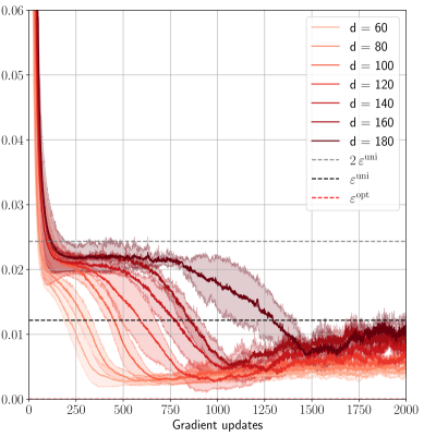
This image is a line chart plotting a performance metric (y-axis) against the number of gradient updates (x-axis) for machine learning models of varying dimensions (`d`). The chart compares the convergence behavior of models with dimensions ranging from 60 to 180. It also includes three horizontal reference lines representing specific theoretical or optimal values.
### Components/Axes
* **X-Axis:** Labeled "Gradient updates". Linear scale from 0 to 2000, with major tick marks every 250 units (0, 250, 500, 750, 1000, 1250, 1500, 1750, 2000).
* **Y-Axis:** Unlabeled, but represents a numerical metric. Linear scale from 0.00 to 0.06, with major tick marks every 0.01 units.
* **Legend (Top-Right Corner):** Contains 10 entries.
* **Solid Lines (Model Dimensions):** A gradient of red/orange colors from light to dark.
* `d = 60` (lightest orange)
* `d = 80`
* `d = 100`
* `d = 120`
* `d = 140`
* `d = 160`
* `d = 180` (darkest red)
* **Dashed Lines (Reference Values):**
* `2 ε^umi` (gray dashed line)
* `ε^umi` (black dashed line)
* `ε^opt` (red dashed line)
### Detailed Analysis
**Trend Verification & Data Points:**
All model dimension lines (`d=60` to `d=180`) follow a similar pattern: a very steep initial decline from a high starting point (off the top of the visible y-axis, >0.06) within the first ~100 updates, followed by a slower, noisy descent that eventually plateaus.
1. **Initial Phase (0-250 updates):** All lines drop precipitously. By 250 updates, the lines have separated, with lower `d` values achieving lower y-axis values.
* `d=60`: ~0.015
* `d=180`: ~0.025
2. **Middle Phase (250-1500 updates):** Lines continue to decrease at a decelerating rate. The ordering is consistent: higher `d` values maintain higher y-values. The lines for `d=160` and `d=180` show the most significant decrease during this phase.
* At 750 updates: `d=60` ~0.008, `d=180` ~0.020.
* At 1250 updates: `d=60` ~0.005, `d=180` ~0.012.
3. **Convergence Phase (1500-2000 updates):** Most lines stabilize into a noisy plateau. The lines for lower dimensions (`d=60` to `d=120`) cluster tightly between ~0.003 and ~0.008. The lines for higher dimensions (`d=140`, `d=160`, `d=180`) converge to a slightly higher band, approximately between ~0.006 and ~0.012.
4. **Reference Lines (Horizontal):**
* `2 ε^umi` (gray dashed): Constant at y ≈ 0.024.
* `ε^umi` (black dashed): Constant at y ≈ 0.012.
* `ε^opt` (red dashed): Constant at y ≈ 0.006.
**Component Isolation & Cross-Referencing:**
* The `d=180` (dark red) line crosses below the `2 ε^umi` threshold around 800 updates and below the `ε^umi` threshold around 1300 updates.
* The `d=60` (light orange) line crosses below `ε^opt` around 500 updates and remains below it.
* By 2000 updates, the cluster of lower-d lines (`d=60` to `d=120`) is centered near or below the `ε^opt` line, while the higher-d lines (`d=140` to `d=180`) are centered near the `ε^umi` line.
### Key Observations
1. **Inverse Relationship:** There is a clear inverse relationship between model dimension (`d`) and the final achieved value of the plotted metric. Lower-dimensional models converge to lower values.
2. **Convergence Speed:** Lower-dimensional models not only reach a lower final value but also converge to their plateau faster (e.g., `d=60` stabilizes around 1000 updates, while `d=180` is still descending noticeably at 1500 updates).
3. **Threshold Crossing:** All models eventually perform better than the `2 ε^umi` benchmark. Higher-dimensional models take longer to surpass the `ε^umi` benchmark, and only the lower-dimensional models consistently achieve performance better than `ε^opt`.
4. **Noise:** The lines exhibit significant high-frequency noise or variance, especially after the initial descent, suggesting stochasticity in the training process or measurement.
### Interpretation
This chart likely visualizes the training dynamics of a machine learning model (e.g., a neural network) where `d` represents a key hyperparameter like hidden layer width or embedding dimension. The y-axis metric is probably a loss function or error rate, where lower is better.
The data suggests a **trade-off between model capacity and optimization difficulty**. Higher-capacity models (`d=180`) have a higher loss throughout training, indicating they are harder to optimize to the same level as lower-capacity models within the given number of updates. This could be due to factors like more complex loss landscapes or the need for more tuning.
The reference lines (`ε^umi`, `ε^opt`) likely represent theoretical bounds or performance targets from a related analysis (e.g., information-theoretic limits or optimal performance under certain assumptions). The chart demonstrates that while all models beat a loose bound (`2 ε^umi`), only smaller models approach the optimal bound (`ε^opt`), highlighting a practical limitation in scaling model size without corresponding adjustments to training procedure or duration. The persistent noise indicates that the optimization process has inherent variance, which is a critical consideration for reproducibility and final model selection.