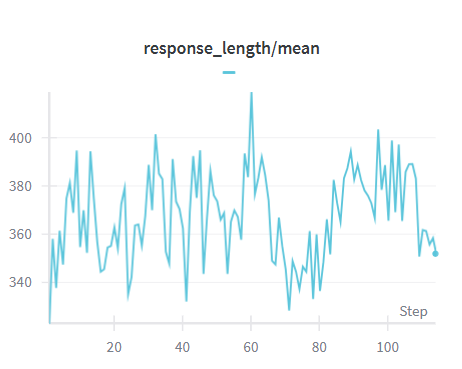
## Line Chart: response_length/mean
### Overview
The image displays a line chart plotting a single data series titled "response_length/mean" against a "Step" axis. The chart shows a highly volatile, oscillating trend with no clear long-term directional slope, characterized by frequent sharp peaks and troughs. The data appears to represent a metric (mean response length) tracked over sequential steps, likely from a training or simulation process.
### Components/Axes
* **Chart Title:** "response_length/mean" (centered at the top).
* **Y-Axis (Vertical):**
* **Label:** Not explicitly labeled with text, but the numerical scale represents the value of "response_length/mean".
* **Scale & Ticks:** Linear scale with major tick marks and labels at **340, 360, 380, 400**. The axis extends slightly below 340 and above 400.
* **X-Axis (Horizontal):**
* **Label:** "Step" (positioned at the bottom-right corner of the axis).
* **Scale & Ticks:** Linear scale with major tick marks and labels at **20, 40, 60, 80, 100**. The axis starts at approximately 0 and ends near 110.
* **Legend:** A legend is present in the **top-right corner** of the chart area. It contains a single entry: a short, horizontal light blue line segment. **No text label is associated with this legend entry.**
* **Data Series:** A single, continuous line plotted in a **light blue/cyan color**. The line connects data points at each step, creating a jagged, noisy profile.
### Detailed Analysis
The line chart depicts the mean response length over approximately 110 steps. The data exhibits high variance and does not follow a smooth trend.
* **Initial Phase (Steps ~0-20):** The series begins near the 340 mark, spikes sharply to ~390, then drops back to ~340, establishing an early pattern of volatility.
* **Mid-Range Volatility (Steps ~20-80):** This section contains the most extreme fluctuations.
* A significant peak occurs around **Step 30**, reaching approximately **400**.
* The **highest peak in the entire chart** appears near **Step 60**, where the value surges above the 400 grid line, estimated at **~410**.
* The **lowest trough** is observed around **Step 70**, where the value dips below the 340 grid line, estimated at **~330**.
* Other notable peaks occur near Step 10 (~390), Step 45 (~390), and Step 55 (~395).
* **Latter Phase (Steps ~80-110):** Volatility continues but within a slightly narrower range.
* A strong peak is seen near **Step 90**, reaching **~395**.
* Another peak near **Step 100** reaches **~400**.
* The series ends with a downward trend, finishing near **Step 110** at a value of approximately **350**.
**Trend Verification:** The line does not exhibit a consistent upward or downward slope. Its primary characteristic is oscillation, with rapid ascents and descents between consecutive steps. The visual trend is one of instability or noise around a central tendency roughly between 360 and 380.
### Key Observations
1. **High Volatility:** The mean response length is not stable; it changes dramatically from one step to the next.
2. **Extreme Values:** The data reaches a maximum of ~410 (Step 60) and a minimum of ~330 (Step 70), a range of approximately 80 units.
3. **Lack of Smooth Trend:** There is no clear learning curve (e.g., steady increase/decrease) or convergence visible in this window. The process appears stochastic or highly sensitive to step-wise changes.
4. **Empty Legend:** The legend provides a color key (light blue line) but no textual identifier for the data series, which is a minor omission for a technical document.
### Interpretation
This chart likely visualizes a performance metric from an iterative process, such as the training of a language model or a reinforcement learning agent, where "Step" corresponds to training iterations or batches. The "response_length/mean" metric tracks the average length of outputs generated by the system.
The observed high volatility suggests that the system's output length is highly variable and not yet under stable control during the tracked period. The absence of a clear trend implies that the mechanism governing response length has not settled into a consistent pattern. The sharp peaks could correspond to specific events in training (e.g., exposure to new data, policy updates) that temporarily cause longer responses, while troughs might indicate corrections or different phases.
For a technical audience, this chart signals a need for investigation. The instability might be undesirable if consistent output length is a goal, or it might be an expected characteristic of an exploratory phase. The key takeaway is that the mean response length is a highly dynamic variable in this system, requiring monitoring and potentially stabilization techniques. The empty legend is a documentation gap that should be addressed by labeling the series (e.g., "Model A - Mean Response Length").