## Line Chart: Response Length/Mean vs. Step
### Overview
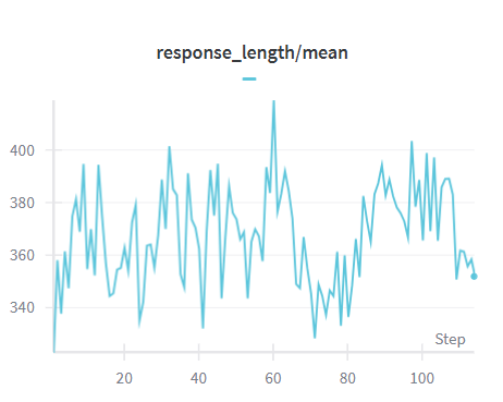
The image is a line chart showing the trend of "response_length/mean" over "step". The chart displays fluctuations in response length, with a general upward trend followed by a slight decrease towards the end.
### Components/Axes
* **Title:** response\_length/mean
* **X-axis:** Step, with markers at approximately 20, 40, 60, 80, and 100.
* **Y-axis:** Values ranging from approximately 340 to 400, with markers at 340, 360, 380, and 400.
* **Data Series:** A single line in light blue representing the "response_length/mean".
### Detailed Analysis
* **Data Series Trend:** The light blue line starts at approximately 340 at step 0. It fluctuates significantly, reaching a peak around step 60 at approximately 405. After step 60, the line generally trends downward, ending at approximately 355 at step 110.
* **Specific Data Points:**
* Step 0: ~340
* Step 20: ~370
* Step 40: ~380
* Step 60: ~405 (peak)
* Step 80: ~360
* Step 100: ~390
* Step 110: ~355
### Key Observations
* The response length/mean exhibits considerable volatility throughout the steps.
* A significant peak occurs around step 60.
* The response length/mean decreases towards the end of the observed steps.
### Interpretation
The chart illustrates how the average response length changes over a series of steps. The fluctuations suggest variability in the responses, possibly due to changes in input or system behavior. The peak around step 60 could indicate a period of particularly long responses, while the subsequent decrease might reflect an adjustment or stabilization in the system. The data suggests that the response length is not constant and is influenced by factors that vary over time.