\n
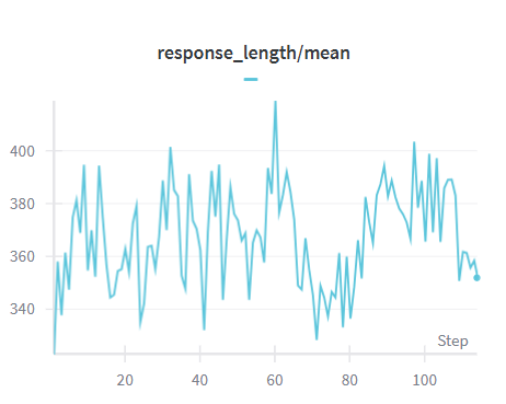
## Line Chart: Response Length / Mean
### Overview
The image presents a line chart illustrating the relationship between 'response_length' and 'mean' over a series of 'Steps'. The chart displays a fluctuating trend, with the response length varying around a central mean value.
### Components/Axes
* **X-axis:** Labeled "Step", ranging from approximately 0 to 100. The axis has tick marks at intervals of 10.
* **Y-axis:** No explicit label, but the title "response\_length/mean" suggests it represents the ratio of response length to the mean. The scale ranges from approximately 340 to 420, with tick marks at intervals of 20.
* **Data Series:** A single blue line representing the 'response_length/mean' value.
* **Title:** "response\_length/mean" positioned at the top-center of the chart.
### Detailed Analysis
The blue line exhibits a highly variable pattern.
* **Initial Trend (Step 0-20):** The line generally slopes upward, starting at approximately 350 and reaching a peak around 390 at Step 20.
* **Fluctuation (Step 20-60):** The line fluctuates significantly between approximately 360 and 400, with several peaks and troughs. A prominent peak occurs around Step 60, reaching a value of approximately 415.
* **Decline (Step 60-80):** After the peak at Step 60, the line declines to a low point of approximately 345 around Step 80.
* **Final Trend (Step 80-100):** The line shows an upward trend again, fluctuating between approximately 360 and 390, ending at around 355 at Step 100.
Approximate data points (read from the chart):
* Step 0: ~350
* Step 10: ~370
* Step 20: ~390
* Step 30: ~380
* Step 40: ~395
* Step 50: ~375
* Step 60: ~415
* Step 70: ~360
* Step 80: ~345
* Step 90: ~370
* Step 100: ~355
### Key Observations
* The response length/mean ratio is highly dynamic, with substantial fluctuations throughout the observed steps.
* The highest value occurs around Step 60, indicating a peak in response length relative to the mean at that point.
* The lowest value occurs around Step 80, suggesting a dip in response length relative to the mean.
* There is no clear overall trend (upward or downward) over the entire range of steps.
### Interpretation
The chart suggests that the response length, relative to its mean, is not stable and varies considerably as the 'Step' progresses. This could indicate a changing pattern in the data being processed, or a dynamic system where the response length is influenced by multiple factors. The peak at Step 60 and the trough at Step 80 might correspond to specific events or conditions within the system. The absence of a clear overall trend suggests that the system is not consistently increasing or decreasing in response length relative to the mean. Further investigation would be needed to understand the underlying causes of these fluctuations and the significance of the observed peaks and troughs. The chart provides a visual representation of the variability in the response length/mean ratio, which could be useful for monitoring system performance or identifying potential anomalies.