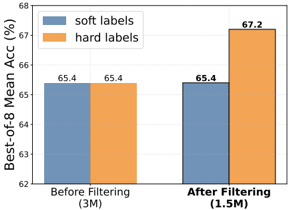
## Bar Chart: Best-of-8 Mean Accuracy Comparison (Soft vs. Hard Labels)
### Overview
The image is a grouped bar chart comparing the "Best-of-8 Mean Accuracy" percentage for two types of labels ("soft labels" and "hard labels") under two conditions: "Before Filtering" and "After Filtering." The chart demonstrates the impact of a data filtering process on model performance.
### Components/Axes
* **Chart Type:** Grouped Bar Chart.
* **Y-Axis:**
* **Label:** "Best-of-8 Mean Acc (%)"
* **Scale:** Linear scale from 62 to 68, with major tick marks at 62, 64, 66, and 68.
* **X-Axis:**
* **Categories:** Two primary categories.
1. **Left Group:** "Before Filtering (3M)"
2. **Right Group:** "After Filtering (1.5M)"
* The parenthetical values "(3M)" and "(1.5M)" likely denote the dataset size in millions of samples before and after filtering, respectively.
* **Legend:**
* **Position:** Top-left corner of the chart area.
* **Items:**
* A blue square labeled "soft labels"
* An orange square labeled "hard labels"
* **Data Series & Values:**
* **Soft Labels (Blue Bars):**
* Before Filtering: 65.4%
* After Filtering: 65.4%
* **Hard Labels (Orange Bars):**
* Before Filtering: 65.4%
* After Filtering: 67.2%
### Detailed Analysis
The chart presents a direct comparison across two dimensions: label type and data filtering state.
1. **Before Filtering (3M dataset):**
* Both "soft labels" and "hard labels" achieve an identical Best-of-8 Mean Accuracy of **65.4%**. The blue and orange bars are of equal height.
2. **After Filtering (1.5M dataset):**
* The performance for "soft labels" (blue bar) remains unchanged at **65.4%**.
* The performance for "hard labels" (orange bar) shows a clear increase, rising to **67.2%**. This bar is visibly taller than its counterpart in the "Before Filtering" group and taller than the adjacent "soft labels" bar.
3. **Effect of Filtering:**
* The filtering process reduced the dataset size by 50% (from 3M to 1.5M samples).
* This reduction had no measurable effect on the accuracy metric for "soft labels."
* Conversely, it resulted in a **1.8 percentage point improvement** (from 65.4% to 67.2%) for "hard labels."
### Key Observations
* **Performance Parity then Divergence:** Initially, both label types perform identically. After filtering, their performance diverges significantly.
* **Filtering Benefit is Label-Dependent:** The primary observation is that the data filtering process selectively benefits the "hard labels," improving their accuracy, while the "soft labels" show no gain.
* **Efficiency Gain:** The "hard labels" achieve higher accuracy with half the data (1.5M vs. 3M), suggesting the filtering successfully removed noisy or uninformative samples that were particularly detrimental to the model's performance when using hard labels.
### Interpretation
This chart suggests that the nature of the label ("soft" vs. "hard") interacts critically with data curation processes. "Hard labels" (typically discrete, one-hot encoded targets) appear to benefit more from the removal of low-quality or ambiguous data points. The filtering likely created a cleaner, more consistent training set that better aligns with the crisp decision boundaries implied by hard labels.
In contrast, "soft labels" (which often represent probability distributions or smoothed targets) may be inherently more robust to noise or ambiguity in the data, explaining why their performance did not change. Alternatively, the specific filtering criteria used might have been less effective at identifying samples that are noisy for a soft-label-based training objective.
The key takeaway is that data filtering is not universally beneficial; its impact is mediated by the training paradigm (here, the label type). For tasks employing hard labels, aggressive data filtering can be a highly effective strategy to boost performance and training efficiency. For tasks using soft labels, the same filtering may yield diminishing returns, and different curation strategies might be required.