## Bar Chart: Best-of-8 Mean Accuracy with Soft and Hard Labels
### Overview
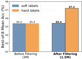
The image is a bar chart comparing the "Best-of-8 Mean Accuracy (%)" using "soft labels" and "hard labels" before and after a filtering process. The x-axis represents the filtering stage (Before Filtering and After Filtering), and the y-axis represents the accuracy percentage.
### Components/Axes
* **Y-axis:** "Best-of-8 Mean Acc (%)", ranging from 62 to 68 with tick marks at each integer value.
* **X-axis:** Two categories: "Before Filtering (3M)" and "After Filtering (1.5M)". The numbers in parentheses likely represent the size of the dataset.
* **Legend:** Located at the top-left of the chart.
* "soft labels" - Represented by blue bars.
* "hard labels" - Represented by orange bars.
### Detailed Analysis
* **Before Filtering (3M):**
* "soft labels": Accuracy is approximately 65.4%.
* "hard labels": Accuracy is approximately 65.4%.
* **After Filtering (1.5M):**
* "soft labels": Accuracy is approximately 65.4%.
* "hard labels": Accuracy is approximately 67.2%.
### Key Observations
* Before filtering, the accuracy is the same for both "soft labels" and "hard labels".
* After filtering, the accuracy of "hard labels" increases significantly, while the accuracy of "soft labels" remains constant.
* The dataset size is reduced from 3M to 1.5M after filtering.
### Interpretation
The chart suggests that filtering the dataset improves the performance of a model trained with "hard labels" but has no impact on a model trained with "soft labels". The filtering process, which reduces the dataset size by half, likely removes noisy or irrelevant data that negatively affects the "hard labels" model. The "soft labels" model may be more robust to such noise, hence the lack of improvement after filtering. The fact that the "soft labels" model performs comparably to the "hard labels" model before filtering suggests that it may be a better choice when dealing with noisy data.