## Scatter Plot: Relationship between C and zcomplexity
### Overview
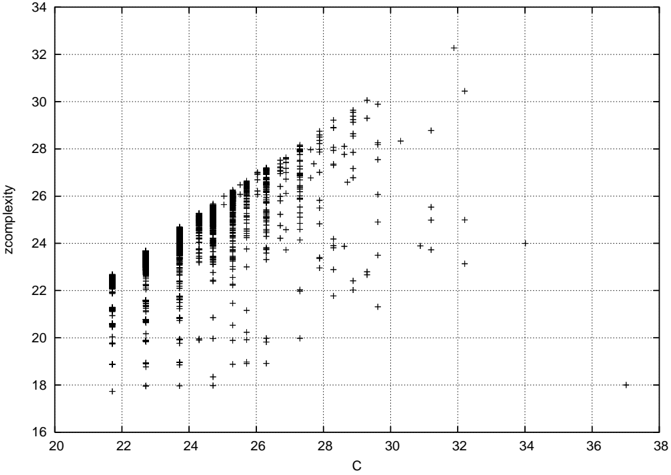
The image is a scatter plot displaying the relationship between two variables: "C" on the horizontal axis and "zcomplexity" on the vertical axis. The plot shows a positive correlation, where higher values of C are generally associated with higher values of zcomplexity. The data points are represented by black plus signs (`+`) on a white background with a light gray grid.
### Components/Axes
* **X-Axis (Horizontal):**
* **Label:** `C`
* **Scale:** Linear scale ranging from 20 to 38.
* **Major Tick Marks:** At intervals of 2 (20, 22, 24, 26, 28, 30, 32, 34, 36, 38).
* **Y-Axis (Vertical):**
* **Label:** `zcomplexity`
* **Scale:** Linear scale ranging from 16 to 34.
* **Major Tick Marks:** At intervals of 2 (16, 18, 20, 22, 24, 26, 28, 30, 32, 34).
* **Data Series:** A single data series plotted as black plus signs (`+`). There is no legend, as only one series is present.
* **Grid:** A light gray, dotted grid is present, aligned with the major tick marks on both axes.
### Detailed Analysis
* **Data Distribution and Trend:**
* The data points form a broad, upward-sloping cloud from the lower-left to the upper-right of the plot area, indicating a positive correlation between C and zcomplexity.
* The relationship is not perfectly linear; the spread (variance) of zcomplexity values increases as C increases.
* **Spatial Distribution of Points:**
* **High Density Region (C ≈ 21 to 28):** The majority of data points are concentrated in a dense, vertical band on the left side of the plot. Within this band, for a given C value, zcomplexity values span a range of approximately 4-6 units. For example, at C ≈ 22, zcomplexity values range from ~18 to ~23.
* **Moderate Density Region (C ≈ 28 to 32):** The points become more scattered. The positive trend continues, but the vertical spread for a given C is wider.
* **Low Density / Outlier Region (C > 32):** There are very few data points. Notable outliers include:
* A point at approximately (C=32.2, zcomplexity=32.3) – the highest zcomplexity value.
* A point at approximately (C=37.0, zcomplexity=18.0) – an outlier with a very high C but low zcomplexity, deviating from the main trend.
* **Approximate Value Ranges:**
* **C:** Data spans from ~21.5 to ~37.0.
* **zcomplexity:** Data spans from ~17.8 to ~32.3.
* The core cluster (where most points lie) is within C ≈ 21.5-28.0 and zcomplexity ≈ 18.0-28.0.
### Key Observations
1. **Positive Correlation:** The primary visual pattern is a clear, positive association between the two variables.
2. **Heteroscedasticity:** The variance of zcomplexity is not constant across the range of C. It is smaller at lower C values and increases substantially at higher C values.
3. **Data Density Gradient:** The number of observations decreases sharply as C increases beyond 28.
4. **Notable Outlier:** The point near (37, 18) is a significant outlier, suggesting an instance where a very high C value did not correspond to a high zcomplexity.
### Interpretation
The scatter plot demonstrates a **positive but noisy relationship** between the variable `C` and `zcomplexity`. This suggests that `C` is a predictor of `zcomplexity`, but not a deterministic one. The increasing spread (heteroscedasticity) implies that the predictive power of `C` for `zcomplexity` weakens as `C` becomes larger; other factors likely have a greater influence on `zcomplexity` at higher levels of `C`.
The high density of points at lower C values indicates that the dataset is skewed towards observations with smaller C. The outlier at high C and low zcomplexity is particularly interesting from an investigative standpoint. It could represent a measurement error, a unique case, or a subgroup where the typical relationship breaks down. In a technical context, this point would warrant further examination to understand its cause.
**In summary, the chart shows that while `zcomplexity` tends to increase with `C`, the relationship is probabilistic and subject to greater uncertainty at higher values of `C`.**