## Density Plot: General Text vs. Medical Text
### Overview
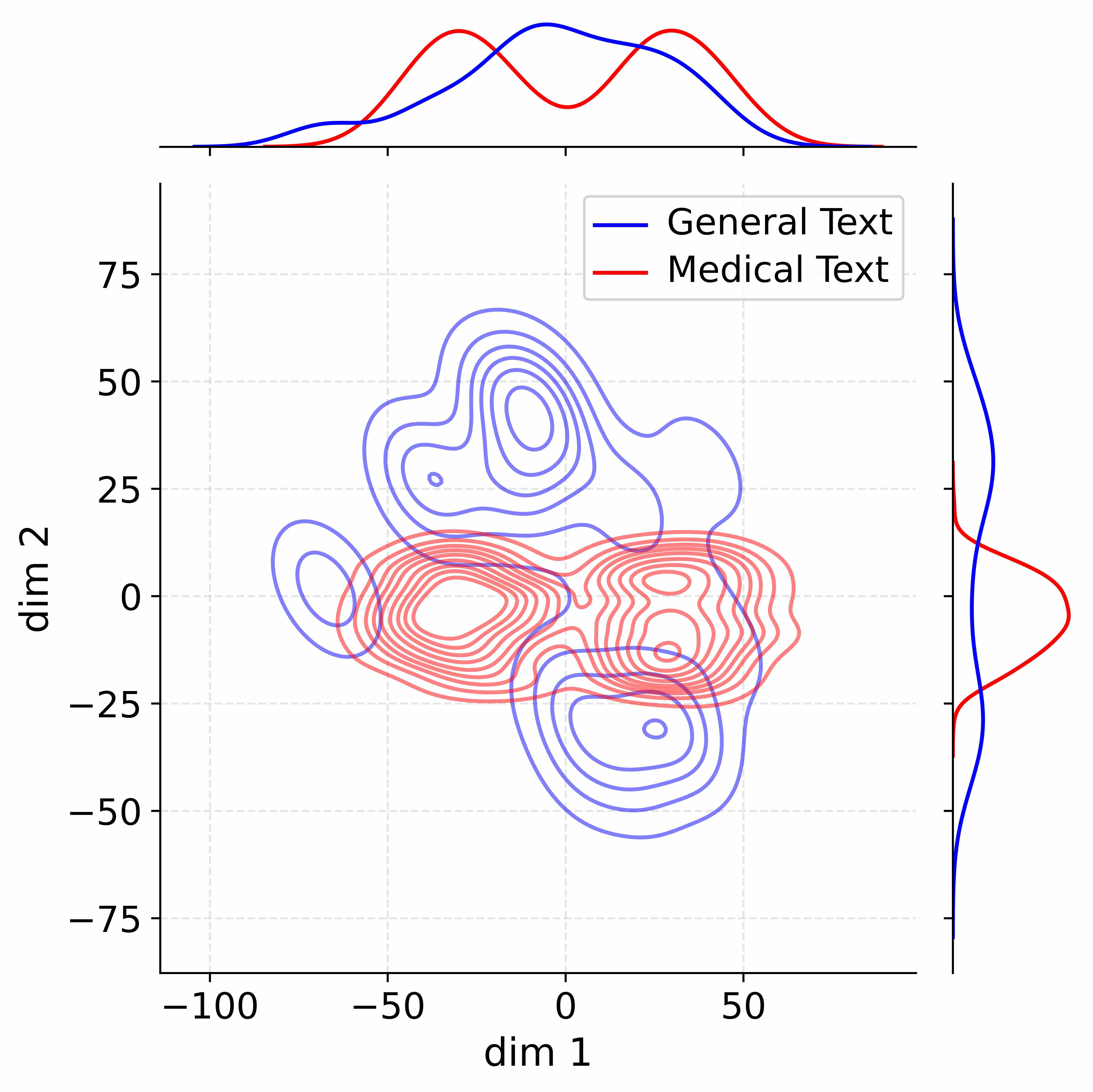
The image is a density plot comparing the distribution of "General Text" and "Medical Text" across two dimensions (dim 1 and dim 2). It includes density contours in the main plot area and marginal density plots along the top and right edges.
### Components/Axes
* **Main Plot:**
* X-axis: "dim 1", ranging from -100 to 50.
* Y-axis: "dim 2", ranging from -75 to 75.
* Gridlines: Light gray, dashed lines at intervals of 25 on both axes.
* Contours:
* Blue contours represent "General Text".
* Red contours represent "Medical Text".
* **Top Marginal Plot:**
* X-axis: Aligned with the main plot's x-axis ("dim 1").
* Y-axis: Density of the data along dim 1.
* Curves:
* Blue curve represents "General Text".
* Red curve represents "Medical Text".
* **Right Marginal Plot:**
* X-axis: Density of the data along dim 2.
* Y-axis: Aligned with the main plot's y-axis ("dim 2").
* Curves:
* Blue curve represents "General Text".
* Red curve represents "Medical Text".
* **Legend:** Located at the top-center of the plot.
* Blue line: "General Text"
* Red line: "Medical Text"
### Detailed Analysis
* **General Text (Blue):**
* Main Plot: The density contours are concentrated in two main regions: one around (-50, 25) and another around (0, 50). There's also a smaller concentration around (25, -25).
* Top Marginal Plot: The blue curve shows two peaks, one around -50 and another around 0.
* Right Marginal Plot: The blue curve shows a peak around 25.
* **Medical Text (Red):**
* Main Plot: The density contours are concentrated in a region around (0, 0), extending towards (50, 0) and (-50, 0).
* Top Marginal Plot: The red curve shows a peak around 0.
* Right Marginal Plot: The red curve shows a peak around 0.
### Key Observations
* The "General Text" distribution is more spread out and has two distinct clusters along dim 1.
* The "Medical Text" distribution is more concentrated around the origin (0, 0) in both dimensions.
* There is some overlap between the two distributions, particularly in the region around (0, 0).
### Interpretation
The density plot suggests that "General Text" and "Medical Text" have different characteristics when projected onto these two dimensions. "General Text" exhibits a bimodal distribution along dim 1, indicating two distinct patterns or clusters within the data. "Medical Text," on the other hand, is more centrally located, suggesting a more uniform or concentrated pattern. The overlap between the two distributions indicates some degree of similarity or shared characteristics, but overall, the two types of text appear to be distinguishable based on these dimensions. The marginal distributions provide further insight into the distribution of each text type along each individual dimension.