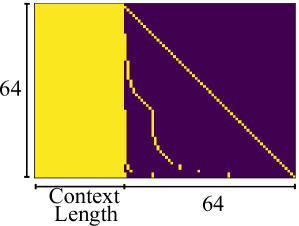
## Heatmap: Context Length vs. 64
### Overview
The image is a heatmap showing the relationship between context length and a fixed value of 64. The heatmap is colored with two distinct colors, yellow and purple, indicating different values or states. The x-axis represents the context length, and the y-axis represents a fixed value of 64.
### Components/Axes
* **X-axis:** "Context Length", with a length of 64 units.
* **Y-axis:** Fixed value of "64" units.
* **Colors:**
* Yellow: Represents one state or value.
* Purple: Represents another state or value.
### Detailed Analysis
The heatmap is divided into two main regions based on color:
1. **Left Region (Yellow):** A rectangular region on the left side of the heatmap is entirely yellow. This region extends vertically for the full height of 64 units and horizontally for a certain context length. The yellow region extends approximately 1/4 of the total width.
2. **Right Region (Purple with Yellow Lines):** The remaining area is predominantly purple, but it contains several yellow lines or curves.
* A diagonal yellow line extends from the top-right corner to the bottom-left corner.
* Several other yellow curves originate from the left edge of the purple region and extend towards the right. These curves are not straight lines and have varying lengths.
### Key Observations
* The yellow region on the left indicates a consistent state or value for shorter context lengths.
* The purple region with yellow lines indicates a change in state or value as the context length increases.
* The diagonal yellow line suggests a linear relationship or transition point.
* The yellow curves indicate more complex relationships or transitions.
### Interpretation
The heatmap likely represents the behavior of a system or model as the context length changes. The yellow region on the left suggests that for shorter context lengths, the system is in a stable state. As the context length increases, the system transitions into a different state, represented by the purple region. The yellow lines and curves within the purple region indicate specific points or conditions where the system's behavior changes. The diagonal line might represent a critical threshold or a linear relationship between context length and some other variable. The curves could represent more complex interactions or dependencies. Without more context, it's difficult to determine the exact meaning of these states and transitions.