## Heatmap Diagram: Context Length Attention Pattern
### Overview
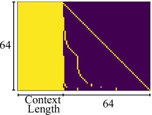
The image is a square heatmap visualization, likely representing an attention pattern or data distribution matrix. It features a distinct two-region color scheme with a diagonal line of data points, plotted against axes labeled for "Context Length." The visualization appears to be a technical diagram, possibly from a machine learning or signal processing context, illustrating how information or attention is distributed across a sequence of length 64.
### Components/Axes
* **X-Axis (Horizontal):**
* **Label:** "Context Length" (centered below the axis).
* **Scale/Markers:** A single numerical marker "64" is present at the far right end of the axis, indicating the maximum value or dimension.
* **Y-Axis (Vertical):**
* **Label:** The number "64" is positioned to the left of the axis, rotated 90 degrees. This likely denotes the dimension or size of the matrix (64x64), but it is not explicitly labeled as "Length" or "Index" like the x-axis.
* **Color Scale/Legend:**
* There is no explicit legend box. However, the color mapping is inferred from the data:
* **Yellow:** Represents a high value, activation, or "allowed" state.
* **Dark Purple/Black:** Represents a low value, inactivation, or "masked" state.
* **Spatial Layout:**
* The main plot area is a square matrix.
* A solid yellow rectangular block occupies the left portion of the matrix.
* The right portion is predominantly dark purple.
* A diagonal line of discrete yellow dots runs from the top-left corner to the bottom-right corner.
* A few isolated yellow dots are scattered near the bottom edge within the purple region.
### Detailed Analysis
* **Data Structure:** The image represents a 64x64 matrix or grid.
* **Primary Regions:**
1. **Left Yellow Block:** This region spans from x=0 to approximately x=16 (estimating based on visual proportion) across all y-values (0 to 64). It indicates a contiguous block of high values or full attention at the beginning of the context.
2. **Right Purple Region:** This covers the remainder of the matrix (approximately x=17 to x=64). It indicates low values or masked positions.
* **Key Data Series (The Diagonal):**
* **Trend Verification:** A clear, continuous diagonal line of yellow dots runs from the top-left (position 0,0) to the bottom-right (position 64,64). This is a perfect positive linear trend.
* **Interpretation:** This pattern is characteristic of a **causal or autoregressive mask**, where each position (token) in a sequence can only attend to itself and previous positions (the yellow block to its left), but not to future positions (the purple area to its right). The diagonal represents self-attention.
* **Anomalies/Secondary Points:**
* There are a few stray yellow dots in the lower part of the purple region, approximately around y=55-60 and x=40-50. These break the perfect causal pattern and may represent noise, a specific model artifact, or a different type of attention head behavior.
### Key Observations
1. **Sharp Boundary:** There is a very sharp, vertical transition from the yellow block to the purple region, suggesting a strict cutoff or mask boundary.
2. **Perfect Diagonal:** The self-attention diagonal is perfectly linear and unbroken, indicating a fundamental property of the system being visualized.
3. **Asymmetric Information Flow:** The visualization strongly implies a directional or sequential process where information flows only from earlier to later positions (left to right in the matrix).
4. **Scale:** The context length is explicitly defined as 64 units.
### Interpretation
This heatmap is almost certainly a visualization of a **causal attention mask** used in transformer-based language models or similar sequence processing architectures.
* **What it demonstrates:** It shows the allowed attention connections for a sequence of 64 tokens. A token at position `i` (y-axis) can attend to all tokens at positions `j` (x-axis) where `j <= i`. This is why the lower-left triangle (including the diagonal) is yellow (allowed), and the upper-right triangle is purple (masked/forbidden).
* **Relationship between elements:** The x-axis "Context Length" represents the key/token positions being attended *to*. The y-axis (implied as "Query Position" or "Current Token Index") represents the token doing the attending. The color at (x, y) indicates if token `y` can attend to token `x`.
* **Why it matters:** This masking is crucial for autoregressive generation (like text completion), ensuring the model cannot "cheat" by looking at future tokens it hasn't generated yet. The solid yellow block on the left shows that early tokens have a very limited context (only themselves and a few predecessors), while later tokens (lower down the y-axis) have a growing context window (the expanding yellow triangle).
* **The anomalies:** The few stray dots in the masked region could be significant. In a research context, they might indicate a model that has learned a slightly non-causal pattern, or they could be visualization artifacts. Their presence warrants investigation if this is from an actual model analysis.
**Language Declaration:** All text within the image is in English.