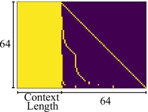
## Heatmap: Context Length vs. Unspecified Metric
### Overview
The image depicts a heatmap with two distinct regions separated by a diagonal boundary. The left region is uniformly yellow, while the right region is purple with a jagged yellow boundary. The axes are labeled "Context Length" (x-axis) and "64" (y-axis), suggesting a relationship between input length and an unspecified metric (possibly performance, error rate, or threshold).
### Components/Axes
- **X-axis (Horizontal)**: Labeled "Context Length," spanning 0 to 64.
- **Y-axis (Vertical)**: Labeled "64," with no explicit scale but likely representing a fixed value or threshold.
- **Colors**:
- **Yellow**: Dominates the left region (0 ≤ Context Length ≤ 64).
- **Purple**: Dominates the right region (Context Length > 64).
- **Yellow Diagonal Line**: Separates the two regions, starting at (0, 64) and ending at (64, 0).
- **Jagged Yellow Line**: Appears in the purple region, starting near (64, 64) and descending stepwise to (64, 0).
### Detailed Analysis
1. **Yellow Region (Left)**:
- Uniformly colored, indicating consistent values across all Context Lengths ≤ 64.
- No internal variation suggests a constant metric (e.g., 100% performance or 0 errors) for inputs within this range.
2. **Purple Region (Right)**:
- Diagonal boundary (yellow line) slopes downward from (0, 64) to (64, 0), implying a linear decrease in the metric as Context Length increases beyond 64.
- Jagged yellow line in the purple region starts near (64, 64) and descends in discrete steps to (64, 0). This could represent:
- A threshold or cutoff point (e.g., maximum tolerable error rate).
- A stepwise degradation in performance for inputs exceeding Context Length = 64.
3. **Boundary Dynamics**:
- The diagonal line acts as a decision boundary, separating "acceptable" (yellow) and "degraded" (purple) regions.
- The jagged line introduces non-linearity in the purple region, suggesting abrupt changes or discrete thresholds.
### Key Observations
- **Threshold at Context Length = 64**: The diagonal boundary and jagged line both anchor at Context Length = 64, indicating a critical transition point.
- **Non-Linearity in Degradation**: The jagged line in the purple region contradicts the smooth diagonal boundary, hinting at discrete failure modes or stepwise limitations.
- **No Data Points in Yellow Region**: The uniform yellow area lacks internal variation, implying no measurable differences within the threshold.
### Interpretation
This heatmap likely visualizes a system's performance or error rate as a function of input context length. The yellow region (Context Length ≤ 64) represents an optimal or stable operating range, while the purple region (Context Length > 64) shows degradation. The diagonal boundary suggests a linear trade-off beyond the threshold, but the jagged line introduces complexity, possibly indicating:
- **Hardware/Software Limits**: Discrete memory or processing constraints causing stepwise failures.
- **Algorithmic Behavior**: Sudden drops in accuracy or increased errors at specific Context Lengths.
- **Data Sparsity**: The jagged line might reflect sparse data points or experimental observations rather than a smooth trend.
The absence of a legend or explicit metric labels leaves the exact interpretation open, but the spatial grounding of the boundary and jagged line strongly implies a critical transition at Context Length = 64, with non-linear effects dominating beyond this point.