## Scatter Plot: MA vs. C
### Overview
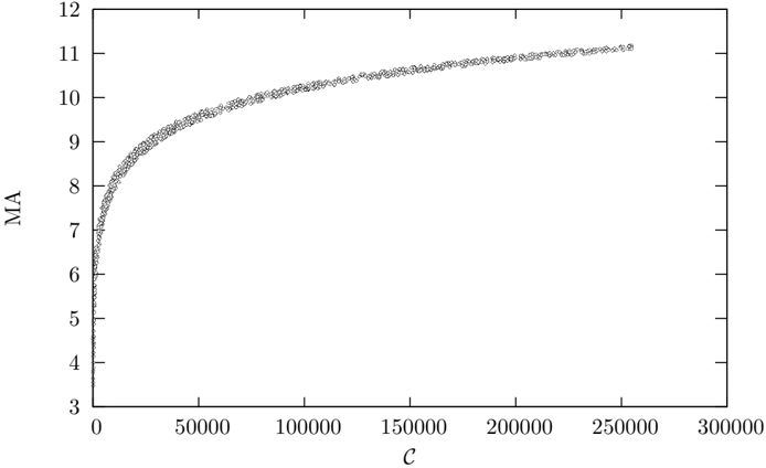
The image displays a scatter plot showing the relationship between two variables, labeled "C" on the horizontal axis and "MA" on the vertical axis. The plot consists of a dense cloud of data points that form a clear, smooth, and monotonically increasing curve. The relationship appears non-linear, with the rate of increase in MA slowing as C becomes larger.
### Components/Axes
* **Chart Type:** Scatter Plot.
* **X-Axis (Horizontal):**
* **Label:** `C` (italicized).
* **Scale:** Linear.
* **Range:** 0 to 300,000.
* **Major Tick Marks & Labels:** 0, 50000, 100000, 150000, 200000, 250000, 300000.
* **Y-Axis (Vertical):**
* **Label:** `MA` (italicized).
* **Scale:** Linear.
* **Range:** 3 to 12.
* **Major Tick Marks & Labels:** 3, 4, 5, 6, 7, 8, 9, 10, 11, 12.
* **Data Series:** A single series of data points, all rendered as small, open circles (○). There is no legend, as only one data series is present.
* **Spatial Layout:** The plot area is bounded by a rectangular frame. The axes labels are centered along their respective axes. The data points are densely packed, forming a continuous band.
### Detailed Analysis
* **Trend Description:** The data series exhibits a strong, positive, non-linear correlation. The curve rises very steeply from the bottom-left corner and gradually flattens out towards the top-right, resembling a logarithmic or square root function shape.
* **Key Data Points (Approximate):**
* At `C ≈ 0`, `MA` starts at approximately **3**.
* The curve passes through `MA ≈ 6` at a very low `C` value (likely under 1,000).
* At `C = 50,000`, `MA` is approximately **9.0**.
* At `C = 100,000`, `MA` is approximately **10.0**.
* At `C = 150,000`, `MA` is approximately **10.5**.
* At `C = 200,000`, `MA` is approximately **10.8**.
* At `C = 250,000`, `MA` is approximately **11.0**.
* The curve appears to approach an asymptote just above `MA = 11` as `C` approaches 300,000.
* **Data Distribution:** The points are tightly clustered along the trend line with very little vertical scatter, indicating a highly deterministic or low-noise relationship between C and MA.
### Key Observations
1. **Diminishing Returns:** The most prominent feature is the clear pattern of diminishing returns. Initial increases in `C` yield large gains in `MA`, but the benefit per unit of `C` decreases substantially as `C` grows.
2. **High Density at Low C:** The data points are extremely dense for `C` values between 0 and approximately 20,000, making the initial ascent appear almost as a solid line.
3. **Consistent Shape:** The curve is smooth and consistent across the entire range, with no visible outliers, breaks, or secondary trends.
4. **Asymptotic Behavior:** The trend suggests that `MA` may have an upper limit or saturation point it is approaching, likely in the range of `MA = 11.0 to 11.5`.
### Interpretation
This plot demonstrates a classic **concave, increasing function** with strong diminishing marginal returns. The variable `MA` is highly sensitive to changes in `C` when `C` is small, but becomes progressively less sensitive as `C` increases.
* **What it Suggests:** The relationship could model many real-world phenomena, such as:
* **Performance vs. Resources:** `C` could represent computational cost (e.g., FLOPs, model size) and `MA` could represent model accuracy or a performance metric. The plot shows that throwing more resources at the problem yields rapidly decreasing performance improvements.
* **Learning Curve:** `C` could be training examples or time, and `MA` could be a skill or knowledge metric. Early learning is fast, but mastery requires exponentially more effort.
* **Physical Law:** It could represent a physical relationship like stress vs. strain in a material (elastic region) or the charging curve of a capacitor.
* **Underlying Function:** The shape is characteristic of functions like `MA = a * ln(C + b) + c` (logarithmic) or `MA = a * sqrt(C) + b` (square root). The tight fit suggests the data may be generated from such a deterministic equation with minimal noise.
* **Practical Implication:** For decision-making, the plot indicates that operating in the region of `C > 150,000` is inefficient if the goal is to maximize `MA` per unit of `C`. The "knee" of the curve, where the rate of return starts to drop sharply, appears to be around `C = 20,000 to 50,000`.