\n
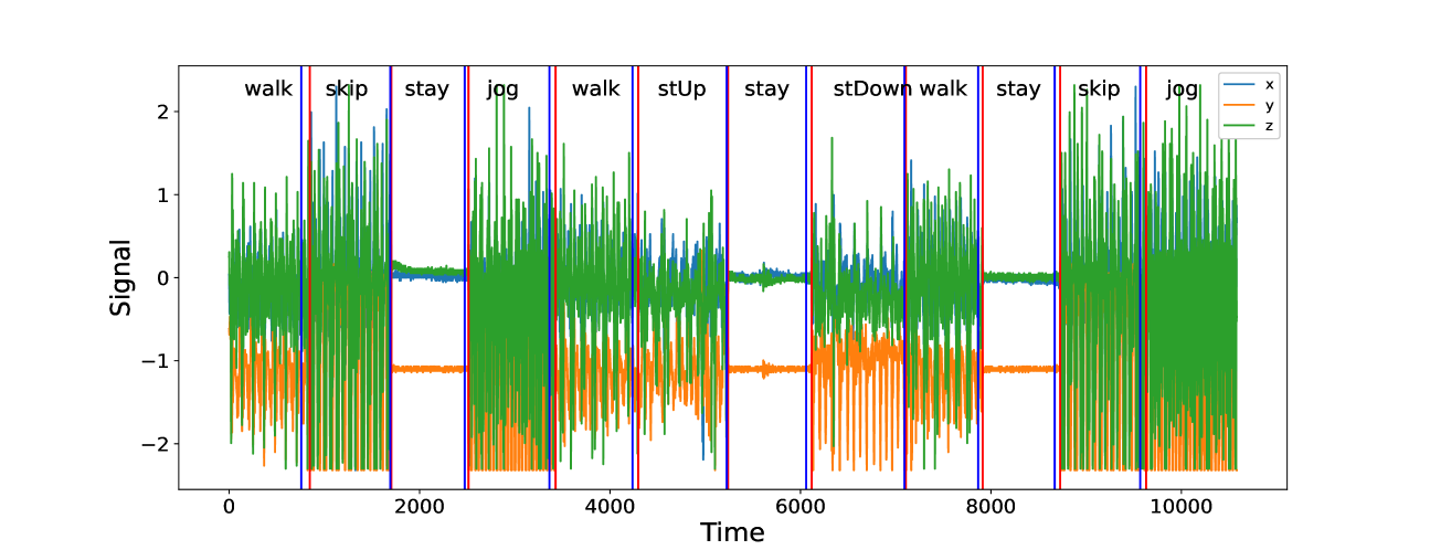
## Time Series Chart: Sensor Signal During Activities
### Overview
The image presents a time series chart displaying sensor signal data over time, segmented into different activity types. The chart shows three distinct signal lines (x, y, and z) fluctuating in amplitude as the activity changes. The x-axis represents time, and the y-axis represents the signal strength. The activities are labeled above the chart, indicating the type of movement or state being recorded.
### Components/Axes
* **X-axis:** Time (ranging from approximately 0 to 11000)
* **Y-axis:** Signal (ranging from approximately -2 to 2)
* **Legend:** Located in the top-right corner, identifies the three signal lines:
* x (represented by a blue line)
* y (represented by an orange line)
* z (represented by a green line)
* **Activity Labels:** Placed horizontally above the chart, marking time intervals with activity names: walk, skip, stay, jog, walk, stUp, stay, stDown, walk, stay, skip, jog.
* **Vertical Lines:** Thin vertical lines are present at the boundaries of each activity segment, visually separating the different activities.
### Detailed Analysis
The chart displays three time series, each representing a different sensor axis (x, y, z). The signal values fluctuate over time, with distinct patterns corresponding to each activity.
* **x (Blue Line):** The x-axis signal generally exhibits smaller amplitude fluctuations compared to the y and z axes. It shows a relatively stable signal during "stay" periods and more variation during dynamic activities like "walk," "skip," and "jog."
* **y (Orange Line):** The y-axis signal shows significant fluctuations, particularly during "skip," "stUp," and "stDown" activities. It appears to have a more pronounced positive and negative swing during these movements.
* **z (Green Line):** The z-axis signal exhibits the largest amplitude fluctuations and is the most visually dominant signal in the chart. It shows clear patterns related to the different activities. For example, during "walk" and "jog," the signal oscillates with a relatively consistent frequency.
Here's a breakdown of signal characteristics for each activity (approximate values):
* **walk (0-1000, 4000-5000, 8000-9000):** z fluctuates between -1.5 and 1.5, y between -0.5 and 0.5, x is relatively stable around 0.
* **skip (1000-2000, 10000-11000):** z fluctuates between -2 and 2, y between -1 and 1, x shows some variation but remains smaller in amplitude.
* **stay (2000-3000, 6000-7000, 9000-10000):** z is relatively stable around 0, y is also close to 0, x is minimal.
* **jog (3000-4000, 11000-end):** z fluctuates between -1.5 and 1.5, y between -0.5 and 0.5, x is relatively stable around 0.
* **stUp (5000-6000):** y shows a large positive spike, z fluctuates between -1 and 1, x is minimal.
* **stDown (7000-8000):** y shows a large negative spike, z fluctuates between -1 and 1, x is minimal.
### Key Observations
* The "stay" activity consistently exhibits the lowest signal amplitude across all three axes, indicating minimal movement.
* "Skip," "stUp," and "stDown" activities generate the highest signal amplitude, particularly in the y-axis, suggesting significant and rapid changes in orientation.
* The z-axis signal appears to be the most sensitive to changes in activity, showing the most pronounced fluctuations.
* The x-axis signal is the least sensitive, providing a relatively stable baseline.
### Interpretation
This chart likely represents data from an accelerometer or similar sensor measuring movement along three axes. The different signal patterns correspond to different human activities. The data suggests that the sensor can effectively differentiate between static ("stay") and dynamic ("walk," "skip," "jog") activities. The "stUp" and "stDown" activities likely represent standing up and sitting down, respectively, and are characterized by a strong signal change in the y-axis, indicating vertical movement.
The consistent patterns observed for each activity suggest that this data could be used to develop an activity recognition system. The sensor data could be used as input to a machine learning model trained to classify different activities based on the signal characteristics. The outliers, such as the large spikes during "stUp" and "stDown," could be used as key features for accurate classification. The relative stability of the x-axis could be used to filter out noise or compensate for sensor drift.