## Chart: Density Plot Comparison
### Overview
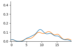
The image shows a density plot comparing two distributions, one represented by a blue line and the other by an orange line. The plot displays the probability density of a variable across a range of values.
### Components/Axes
* **X-axis:** Ranges from 0 to 20, with tick marks at intervals of 5 (0, 5, 10, 15, 20).
* **Y-axis:** Ranges from 0.0 to 0.4, with tick marks at intervals of 0.1 (0.0, 0.1, 0.2, 0.3, 0.4).
* **Legend:** There is no explicit legend, but the two distributions are represented by a blue line and an orange line.
### Detailed Analysis
* **Blue Line:** The blue line represents one distribution. It starts near 0.0 at x=0, rises to a peak around x=10 with a density of approximately 0.12, then decreases to near 0.0 at x=20. There is a small bump around x=5 with a density of approximately 0.03.
* **Orange Line:** The orange line represents another distribution. It also starts near 0.0 at x=0, rises to a peak around x=11 with a density of approximately 0.10, then decreases to near 0.0 at x=20. There is a small bump around x=5 with a density of approximately 0.02.
### Key Observations
* Both distributions have a similar shape, with a primary peak around x=10-11.
* The blue distribution has a slightly higher peak density than the orange distribution.
* Both distributions have a small bump around x=5.
### Interpretation
The density plot compares two distributions, showing their relative probabilities across a range of values. The similarity in shape suggests that the underlying processes generating these distributions may be related. The slight difference in peak density indicates that one distribution is more concentrated around its mean than the other. The bump around x=5 suggests a possible secondary mode or influence in both distributions.