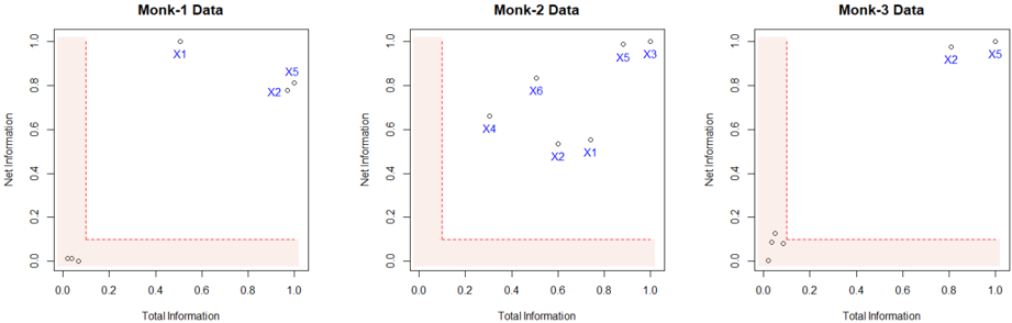
## Scatter Plot Series: Monk Data Analysis
### Overview
The image displays three horizontally arranged scatter plots, each titled "Monk-1 Data", "Monk-2 Data", and "Monk-3 Data". Each plot graphs "Net Information" (y-axis) against "Total Information" (x-axis) for a set of labeled data points. A shaded region in the bottom-left corner of each plot appears to define a boundary or threshold.
### Components/Axes
* **Plot Titles:** "Monk-1 Data" (left), "Monk-2 Data" (center), "Monk-3 Data" (right).
* **X-Axis Label:** "Total Information" (present on all three plots).
* **Y-Axis Label:** "Net Information" (present on all three plots).
* **Axis Scales:** Both axes on all plots range from 0.0 to 1.0, with major tick marks at 0.0, 0.2, 0.4, 0.6, 0.8, and 1.0.
* **Data Points:** Each point is represented by a small open circle and is labeled with blue text (e.g., "X1", "X2").
* **Shaded Region:** A light red, semi-transparent shaded area occupies the bottom-left corner of each plot. It is bounded by a dashed red line that runs vertically from (0.0, 0.0) to approximately (0.1, 0.1) and then horizontally to (1.0, 0.1). This creates an L-shaped region.
### Detailed Analysis
**Monk-1 Data (Left Plot):**
* **Point Locations (Approximate):**
* X1: Total Information ≈ 0.5, Net Information ≈ 0.95
* X2: Total Information ≈ 0.9, Net Information ≈ 0.78
* X5: Total Information ≈ 1.0, Net Information ≈ 0.82
* **Trend/Cluster:** All three labeled points are located in the upper-right quadrant, well outside the shaded region. They show relatively high values for both Total and Net Information.
**Monk-2 Data (Center Plot):**
* **Point Locations (Approximate):**
* X4: Total Information ≈ 0.3, Net Information ≈ 0.65
* X6: Total Information ≈ 0.5, Net Information ≈ 0.82
* X2: Total Information ≈ 0.6, Net Information ≈ 0.52
* X1: Total Information ≈ 0.75, Net Information ≈ 0.55
* X5: Total Information ≈ 0.9, Net Information ≈ 0.95
* X3: Total Information ≈ 1.0, Net Information ≈ 0.98
* **Trend/Cluster:** The points are more dispersed than in Monk-1. They form a loose cluster in the central and upper-right areas. X4 and X6 have moderate Total Information but higher Net Information. X2 and X1 have higher Total Information but lower Net Information. X5 and X3 are high on both metrics.
**Monk-3 Data (Right Plot):**
* **Point Locations (Approximate):**
* X2: Total Information ≈ 0.8, Net Information ≈ 0.95
* X5: Total Information ≈ 1.0, Net Information ≈ 0.98
* **Trend/Cluster:** Only two labeled points are visible, both located in the extreme upper-right corner, indicating very high values for both Total and Net Information. There are also several unlabeled points clustered near the origin (0.0, 0.0), inside or very close to the shaded region.
### Key Observations
1. **Consistent Boundary:** The shaded L-shaped region is identical across all three plots, suggesting a common threshold for "low information" (Total Information < ~0.1 AND Net Information < 0.1).
2. **Point Progression:** The labeled points (X1, X2, X3, X4, X5, X6) appear in different combinations and positions across the three datasets. For example, X5 is present in all three and consistently shows high values.
3. **Data Density:** Monk-3 shows a distinct cluster of unlabeled points near the origin, which is not prominently visible in the other two plots.
4. **Dispersion:** Monk-2 exhibits the greatest dispersion of its labeled points across the plot area, while Monk-1 and Monk-3 show tighter clustering in the high-value region.
### Interpretation
This visualization compares three different datasets ("Monk" 1, 2, and 3) based on two information metrics. The "Total Information" likely represents the raw amount of data or features available, while "Net Information" could represent the useful, non-redundant, or predictive information content.
* **The Shaded Region** acts as a "low-value" zone. Points falling within it (like the unlabeled cluster in Monk-3) represent cases with minimal total and net information—potentially noise, irrelevant features, or failed data acquisitions.
* **The Labeled Points (X1-X6)** are likely specific features, models, or experimental conditions being tracked across the three Monk datasets. Their movement between plots shows how their information profile changes depending on the dataset context.
* **Dataset Character:**
* **Monk-1** appears to be a "clean" dataset where all tracked features (X1, X2, X5) provide high net information relative to their total information.
* **Monk-2** is more complex or noisy. Features show a trade-off: some (X4, X6) have high net information efficiency (high y, moderate x), while others (X2, X1) have high total information but lower net yield (high x, moderate y).
* **Monk-3** is polarized. It contains a significant amount of low-value data (cluster near origin) but also features (X2, X5) that are exceptionally high in both total and net information, suggesting a dataset with a few very powerful signals amidst much noise.
The charts effectively demonstrate that the same feature (e.g., X5) can have a consistently high information profile, while others vary significantly, and that the underlying datasets have fundamentally different information structures.