## Scatter Plot: Monk Data Analysis
### Overview
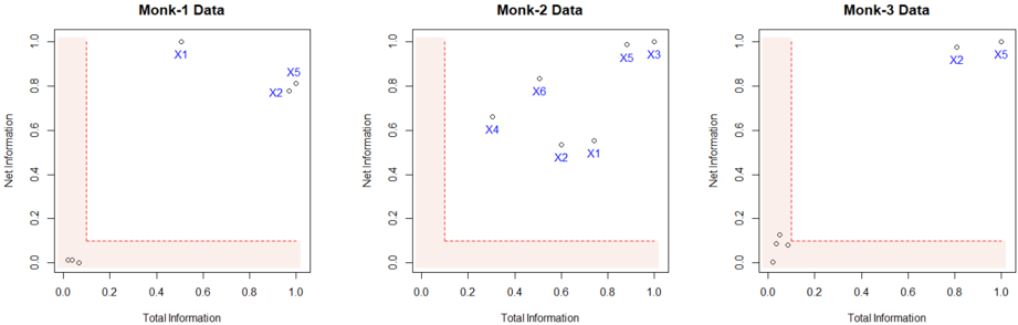
The image presents three scatter plots, each representing data for a different "Monk" dataset (Monk-1, Monk-2, and Monk-3). Each plot displays "Net Information" on the y-axis versus "Total Information" on the x-axis. The plots also include a shaded region in the bottom-left corner, and labeled data points.
### Components/Axes
* **Titles:** Each plot has a title indicating the dataset: "Monk-1 Data", "Monk-2 Data", and "Monk-3 Data".
* **X-axis:** Labeled "Total Information", with a scale from 0.0 to 1.0 in increments of 0.2.
* **Y-axis:** Labeled "Net Information", with a scale from 0.0 to 1.0 in increments of 0.2.
* **Data Points:** Each data point is represented by a small circle, with some points labeled as "X1", "X2", "X3", "X4", "X5", and "X6" in blue.
* **Shaded Region:** A shaded region is present in the bottom-left corner of each plot, bounded by x=0.2 and y=0.1, approximately. The region is defined by a dashed red line.
### Detailed Analysis
**Monk-1 Data:**
* X-axis: "Total Information"
* Y-axis: "Net Information"
* Data points:
* X1: Approximately (0.5, 0.95)
* X2: Approximately (0.9, 0.75)
* X5: Approximately (0.95, 0.8)
* Trend: The data points are scattered, with two points in the upper-right quadrant and a cluster of points near the origin.
**Monk-2 Data:**
* X-axis: "Total Information"
* Y-axis: "Net Information"
* Data points:
* X1: Approximately (0.8, 0.5)
* X2: Approximately (0.6, 0.5)
* X3: Approximately (1.0, 0.95)
* X4: Approximately (0.3, 0.65)
* X5: Approximately (0.95, 0.95)
* X6: Approximately (0.4, 0.8)
* Trend: The data points are more dispersed compared to Monk-1, with points spread across the plot.
**Monk-3 Data:**
* X-axis: "Total Information"
* Y-axis: "Net Information"
* Data points:
* X2: Approximately (0.8, 0.95)
* X5: Approximately (1.0, 0.95)
* Trend: Most data points are clustered near the origin, with two points in the upper-right quadrant.
### Key Observations
* The shaded region in each plot appears to define a threshold or boundary.
* Monk-1 and Monk-3 datasets have a cluster of points near the origin, while Monk-2 has more dispersed points.
* The labeled data points (X1, X2, etc.) are not consistent across the datasets.
### Interpretation
The plots likely represent the distribution of data points in terms of "Total Information" and "Net Information" for different Monk datasets. The shaded region might indicate a region of low information or noise. The varying distributions suggest that the Monk datasets have different characteristics in terms of information content and distribution. The specific meaning of "Total Information" and "Net Information" is not provided, but the plots allow for a visual comparison of these metrics across the datasets.