## Scatter Plots: Monk Data Analysis
### Overview
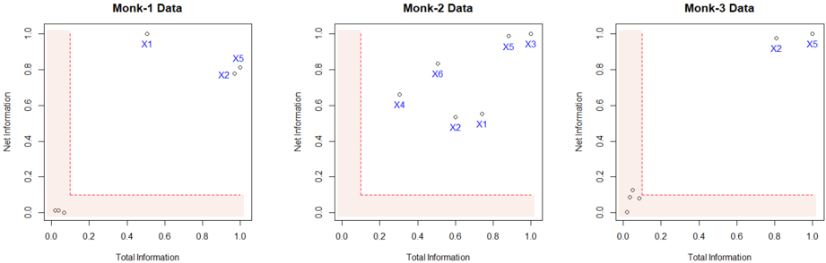
Three scatter plots labeled "Monk-1 Data," "Monk-2 Data," and "Monk-3 Data" visualize relationships between "Total Information" (x-axis) and "Net Information" (y-axis). Each plot contains blue data points labeled X1–X6 and a red dashed L-shaped boundary line. The axes range from 0 to 1.0 in both dimensions.
### Components/Axes
- **X-axis**: "Total Information" (0.0 to 1.0)
- **Y-axis**: "Net Information" (0.0 to 1.0)
- **Red Dashed Line**: Forms an L-shape, dividing the plot into two regions:
- Vertical segment: x=0.0, y=0.0 to y=1.0
- Horizontal segment: x=0.0 to x=1.0, y=0.0
- **Data Points**: Blue dots labeled X1–X6 with approximate coordinates:
- **Monk-1**:
- X1: (0.5, 0.9)
- X5: (0.8, 0.8)
- X2: (0.7, 0.7)
- X3: (0.6, 0.6)
- X4: (0.4, 0.5)
- X6: (0.3, 0.4)
- **Monk-2**:
- X1: (0.7, 0.5)
- X2: (0.6, 0.4)
- X3: (0.8, 0.9)
- X4: (0.5, 0.6)
- X5: (0.9, 0.95)
- X6: (0.4, 0.7)
- **Monk-3**:
- X1: (0.1, 0.1)
- X2: (0.2, 0.15)
- X3: (0.3, 0.2)
- X4: (0.4, 0.25)
- X5: (0.9, 0.95)
- X6: (0.8, 0.9)
### Detailed Analysis
1. **Red Boundary Line**:
- Acts as a threshold, separating regions where "Net Information" is either above or below the line.
- All data points lie **above** the red line, suggesting they meet a minimum "Net Information" criterion.
2. **Data Point Distribution**:
- **Monk-1**: Points cluster near the top-right quadrant (x=0.4–0.8, y=0.5–0.9), with X1 and X5 being the most extreme.
- **Monk-2**: Points are more dispersed, with X5 (0.9, 0.95) and X3 (0.8, 0.9) near the top-right, while X1 and X2 are closer to the red line.
- **Monk-3**: Points are tightly clustered near the bottom-left (x=0.1–0.4, y=0.1–0.25) except for X5 and X6, which are outliers in the top-right.
3. **Trends**:
- **Monk-1**: Data points show a moderate positive correlation (y ≈ x + 0.3 for X1–X3).
- **Monk-2**: No clear trend; points are scattered but skewed toward higher y-values.
- **Monk-3**: Strong clustering in the bottom-left, with two outliers (X5, X6) suggesting anomalies.
### Key Observations
- **Outliers**:
- Monk-3’s X5 and X6 deviate significantly from the cluster, potentially indicating rare or exceptional cases.
- Monk-2’s X1 and X2 are closer to the red line, suggesting marginal compliance with the threshold.
- **Boundary Significance**: The red line likely represents a decision boundary (e.g., minimum acceptable "Net Information").
- **Dataset Variability**: Monk-3’s data is more concentrated, while Monk-1 and Monk-2 show broader distributions.
### Interpretation
The plots likely represent a classification or threshold analysis where:
- **Red Line**: Defines a critical threshold (e.g., "Net Information ≥ 0.0" is required for validity).
- **Data Points**: Represent instances evaluated against this threshold. All points meet the criterion, but Monk-3’s outliers (X5, X6) may require further investigation.
- **Monk-3 Anomalies**: The bottom-left cluster could indicate a subgroup with low "Total Information" but sufficient "Net Information," while X5/X6 might represent high-value outliers.
- **Practical Implications**: The red line’s L-shape suggests a binary decision rule (e.g., "If Total Information = 0, Net Information must be ≥ 1.0; otherwise, Net Information ≥ 0.0"). This could model scenarios like resource allocation or risk assessment.
No textual content in non-English languages was observed. All labels and values are transcribed with approximate precision based on visual estimation.