## Line Graphs: δ*(t) vs Time Step t
### Overview
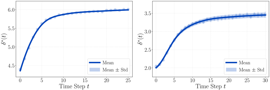
Two line graphs are presented side-by-side, depicting the evolution of δ*(t) over time steps (t). Both graphs show a sigmoidal (S-shaped) curve with a plateau phase, accompanied by shaded regions representing variability (Mean ± Std). The left graph spans t=0 to t=25, while the right graph extends to t=30.
---
### Components/Axes
- **X-axis**: "Time Step t" (integer values, 0–25 for left graph; 0–30 for right graph).
- **Y-axis**: "δ*(t)" (continuous values).
- Left graph: 4.5–6.0
- Right graph: 2.0–3.5
- **Legends**:
- **Blue line**: "Mean" (solid line).
- **Shaded blue region**: "Mean ± Std" (standard deviation around the mean).
---
### Detailed Analysis
#### Left Graph (t=0–25)
- **Trend**: δ*(t) increases rapidly from ~4.5 at t=0 to ~6.0 by t=10, then plateaus with minimal growth.
- **Key Data Points**:
- t=0: δ*(t) ≈ 4.5
- t=5: δ*(t) ≈ 5.3
- t=10: δ*(t) ≈ 5.8
- t=20: δ*(t) ≈ 5.95
- t=25: δ*(t) ≈ 6.0
- **Variability**: Shaded region (Mean ± Std) remains narrow (~±0.1) throughout, indicating low variance.
#### Right Graph (t=0–30)
- **Trend**: δ*(t) rises from ~2.0 at t=0 to ~3.5 by t=20, then plateaus.
- **Key Data Points**:
- t=0: δ*(t) ≈ 2.0
- t=5: δ*(t) ≈ 2.6
- t=15: δ*(t) ≈ 3.2
- t=25: δ*(t) ≈ 3.45
- t=30: δ*(t) ≈ 3.5
- **Variability**: Shaded region (~±0.1) is consistent, mirroring the left graph’s low variance.
---
### Key Observations
1. **Sigmoidal Behavior**: Both graphs exhibit a rapid initial increase followed by a plateau, suggesting a system approaching equilibrium.
2. **Plateau Values**:
- Left graph plateaus at δ*(t) ≈ 6.0 (higher magnitude).
- Right graph plateaus at δ*(t) ≈ 3.5 (lower magnitude).
3. **Consistency**: Shaded regions (Mean ± Std) are tightly clustered, indicating minimal variability in measurements.
4. **Time to Plateau**:
- Left graph stabilizes by t=20.
- Right graph stabilizes by t=25–30.
---
### Interpretation
The graphs likely represent a dynamic system (e.g., biological, chemical, or engineering process) where δ*(t) evolves over time. The sigmoidal trend implies a transition from an initial state to a stable equilibrium. The higher plateau in the left graph suggests a system with greater capacity or different parameters compared to the right graph. The tight standard deviation bands indicate reliable, reproducible measurements. The extended time horizon in the right graph (t=30) may reflect a slower convergence rate or a different experimental setup. These results could inform optimization strategies, such as adjusting parameters to achieve desired δ*(t) values more efficiently.