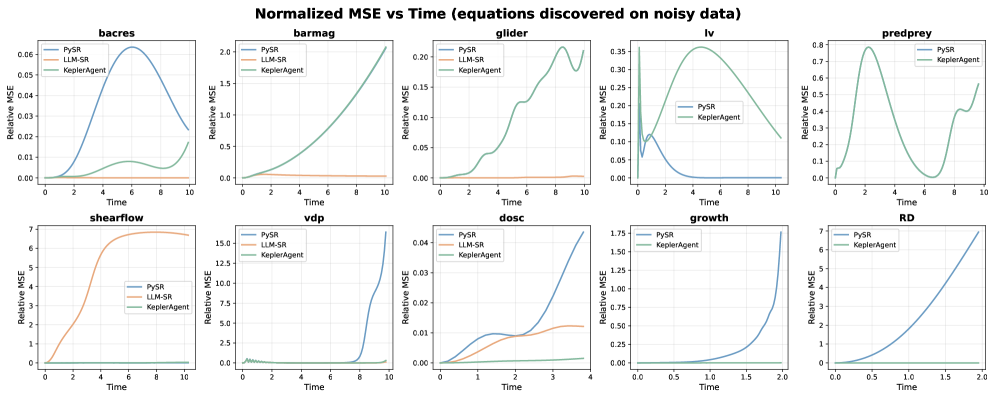
## Line Chart: Normalized MSE vs Time (equations discovered on noisy data)
### Overview
The image contains a series of line charts displaying the Normalized Mean Squared Error (MSE) versus Time for different systems or models. Each chart compares the performance of three methods: PySR, LLM-SR, and KeplerAgent. The x-axis represents Time, and the y-axis represents Relative MSE. There are 10 subplots, each representing a different system or model.
### Components/Axes
* **Title:** Normalized MSE vs Time (equations discovered on noisy data)
* **X-axis:** Time
* **Y-axis:** Relative MSE
* **Legend:** Located in the top-left corner of each subplot.
* PySR (Blue line)
* LLM-SR (Orange line)
* KeplerAgent (Green line)
* **Subplots (from left to right, top to bottom):** bacres, barmag, glider, lv, predprey, shearflow, vdp, dosc, growth, RD
### Detailed Analysis or ### Content Details
**1. bacres**
* X-axis: 0 to 10
* Y-axis: 0.00 to 0.06
* PySR: Initially at 0, rises to a peak around Time=6 (MSE=0.06), then decreases to around 0.01 at Time=10.
* LLM-SR: Stays relatively constant around 0.005.
* KeplerAgent: Stays relatively constant around 0.
**2. barmag**
* X-axis: 0 to 10
* Y-axis: 0.0 to 2.0
* PySR: Increases steadily from 0 to approximately 1.8 at Time=10.
* LLM-SR: Stays relatively constant around 0.2.
* KeplerAgent: Stays relatively constant around 0.
**3. glider**
* X-axis: 0 to 10
* Y-axis: 0.00 to 0.20
* PySR: Starts near 0, increases with oscillations to approximately 0.18 at Time=10.
* LLM-SR: Stays relatively constant around 0.02.
* KeplerAgent: Stays relatively constant around 0.
**4. lv**
* X-axis: 0 to 10
* Y-axis: 0.00 to 0.35
* PySR: Starts at approximately 0.1, decreases to near 0 around Time=4, then remains near 0.
* KeplerAgent: Rises to a peak around Time=4 (MSE=0.35), then decreases to around 0.02 at Time=10.
* LLM-SR: Not present in the legend, but appears to be the orange line, which is not visible in the chart.
**5. predprey**
* X-axis: 0 to 10
* Y-axis: 0.0 to 0.8
* PySR: Oscillates, starting at 0, peaking around Time=3 (MSE=0.75), decreasing, then increasing again.
* KeplerAgent: Stays relatively constant around 0.
* LLM-SR: Not present in the legend, but appears to be the orange line, which is not visible in the chart.
**6. shearflow**
* X-axis: 0 to 10
* Y-axis: 0 to 7
* PySR: Increases rapidly from 0 to approximately 6.8 around Time=6, then plateaus.
* LLM-SR: Stays relatively constant around 0.
* KeplerAgent: Stays relatively constant around 0.
**7. vdp**
* X-axis: 0 to 10
* Y-axis: 0.0 to 15.0
* PySR: Increases rapidly from 0 to approximately 14.5 at Time=10.
* LLM-SR: Stays relatively constant around 0.2.
* KeplerAgent: Stays relatively constant around 0.
**8. dosc**
* X-axis: 0 to 4
* Y-axis: 0.00 to 0.04
* PySR: Increases from 0 to approximately 0.035 at Time=4.
* LLM-SR: Stays relatively constant around 0.005.
* KeplerAgent: Stays relatively constant around 0.
**9. growth**
* X-axis: 0.0 to 2.0
* Y-axis: 0.00 to 1.75
* PySR: Increases from 0 to approximately 0.3 at Time=2.
* KeplerAgent: Stays relatively constant around 0.
* LLM-SR: Not present in the legend, but appears to be the orange line, which is not visible in the chart.
**10. RD**
* X-axis: 0.0 to 2.0
* Y-axis: 0 to 7
* PySR: Increases from 0 to approximately 7 at Time=2.
* KeplerAgent: Stays relatively constant around 0.
* LLM-SR: Not present in the legend, but appears to be the orange line, which is not visible in the chart.
### Key Observations
* PySR shows significant variation in MSE across different systems.
* LLM-SR generally maintains a low and stable MSE.
* KeplerAgent consistently shows very low MSE across all systems.
* In some plots (lv, predprey), the LLM-SR line is not visible, suggesting it might overlap with the x-axis or have very low values.
* The time scales vary across the subplots.
### Interpretation
The charts compare the performance of three different methods (PySR, LLM-SR, and KeplerAgent) in discovering equations from noisy data, as measured by Normalized MSE over time. The consistently low MSE of KeplerAgent suggests it is the most accurate method across these systems. LLM-SR also shows relatively low MSE, indicating good performance. PySR's performance varies significantly depending on the system, suggesting it may be more sensitive to the specific characteristics of the data. The varying time scales and MSE ranges across the subplots indicate that the systems being modeled have different dynamics and error characteristics.