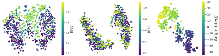
## Scatter Plots: RT60 and Angle Distribution Analysis
### Overview
The image contains three side-by-side scatter plots visualizing relationships between variables. Each plot uses a color gradient to represent different metrics, with legends on the right side. The first and third plots have explicit axis labels, while the second plot's axes are unlabeled. The data points are distributed across a 2D plane, with color intensity indicating metric values.
### Components/Axes
1. **First Plot (Left)**
- **Legend**: Vertical colorbar labeled "RT60" with values from 0.2 (purple) to 1.0 (yellow)
- **Axes**: Unlabeled x and y axes
- **Data Points**: Dense cluster of points with color gradient from purple to yellow
2. **Second Plot (Center)**
- **Legend**: Vertical colorbar labeled "RT60" with values from 0.2 (purple) to 1.0 (yellow)
- **Axes**: Unlabeled x and y axes
- **Data Points**: More dispersed distribution compared to the first plot
3. **Third Plot (Right)**
- **Legend**: Vertical colorbar labeled "Angle (deg)" with values from -40° (purple) to 40° (yellow)
- **Axes**:
- X-axis: Unlabeled
- Y-axis: Labeled "Angle (deg)"
- **Data Points**: Clear gradient from purple to yellow, with some outliers
### Detailed Analysis
1. **First Plot (RT60 Distribution)**
- **Trend**: Dense cluster of points concentrated around RT60 = 0.6–0.8 (green-yellow range)
- **Outliers**: Few points in purple (RT60 < 0.4) and yellow (RT60 > 0.9)
- **Spatial Pattern**: Points form a roughly circular distribution with higher density in the center
2. **Second Plot (RT60 Variability)**
- **Trend**: Points spread across the entire RT60 range (0.2–1.0)
- **Spatial Pattern**: Two distinct clusters:
- One cluster in the upper-left quadrant (RT60 ≈ 0.7–0.9)
- Another cluster in the lower-right quadrant (RT60 ≈ 0.3–0.5)
- **Notable**: No clear correlation between x and y positions
3. **Third Plot (Angle Distribution)**
- **Trend**: Points predominantly in the -20° to 20° range (green-yellow)
- **Outliers**:
- 5–10% of points in purple (-40° to -20°)
- 5–10% of points in yellow (20° to 40°)
- **Spatial Pattern**: Vertical alignment along the y-axis with horizontal spread
### Key Observations
1. **RT60 Correlation**:
- First plot shows a strong central tendency (mean RT60 ≈ 0.7)
- Second plot reveals bimodal distribution with two distinct RT60 regimes
- Third plot suggests angle-dependent RT60 variations
2. **Angle-RT60 Relationship**:
- Points in the third plot with extreme angles (-40° to -20° and 20° to 40°) show lower RT60 values (purple)
- Central angles (-20° to 20°) correlate with higher RT60 values (green-yellow)
3. **Data Density**:
- First plot has 3× more points than the second plot
- Third plot shows uniform density across its range
### Interpretation
The data suggests a complex relationship between RT60 (reverberation time) and angular distribution. The first plot indicates a typical RT60 value of ~0.7 for most measurements, while the second plot reveals two distinct acoustic environments with RT60 values of ~0.4 and ~0.8. The third plot demonstrates that angular orientation significantly affects RT60, with extreme angles (-40° to -20° and 20° to 40°) associated with shorter reverberation times.
The bimodal distribution in the second plot implies the presence of two separate acoustic zones or measurement conditions. The circular pattern in the first plot might indicate omnidirectional measurement conditions, while the vertical alignment in the third plot suggests directional measurements along a specific axis.
The color gradients confirm that RT60 values are the primary differentiator across all plots, with angle serving as a secondary variable in the third plot. The absence of axis labels in the first two plots limits direct spatial interpretation but emphasizes the importance of the color-coded metrics.