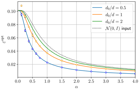
## Line Chart: Relationship between α and ε_opt for Different d₀/d Ratios
### Overview
The image displays a line chart plotting the optimal error (ε_opt) against a parameter α for four different input conditions. The chart demonstrates how ε_opt decreases as α increases, with the rate of decrease depending on the ratio d₀/d. The data includes both continuous curves and discrete data points.
### Components/Axes
* **X-axis (Horizontal):**
* **Label:** `α`
* **Scale:** Linear, ranging from 0.0 to 4.0.
* **Major Ticks:** 0.0, 0.5, 1.0, 1.5, 2.0, 2.5, 3.0, 3.5, 4.0.
* **Y-axis (Vertical):**
* **Label:** `ε_opt`
* **Scale:** Linear, ranging from 0.00 to 0.10.
* **Major Ticks:** 0.00, 0.02, 0.04, 0.06, 0.08, 0.10.
* **Legend (Positioned in the top-right corner):**
* **Blue solid line:** `d₀/d = 0.5`
* **Orange solid line:** `d₀/d = 1`
* **Green solid line:** `d₀/d = 2`
* **Black dotted line:** `𝒩(0,I) input` (This denotes a standard normal distribution input with mean 0 and identity covariance).
* **Data Points:**
* **Blue circles (○):** Correspond to the `d₀/d = 0.5` curve.
* **Orange squares (□):** Correspond to the `d₀/d = 1` curve.
* The green and dotted lines do not have visible discrete markers.
### Detailed Analysis
The chart shows four distinct, monotonically decreasing curves. All curves start at their maximum ε_opt value at α=0 and decay towards zero as α increases.
1. **Trend Verification & Data Points (Approximate):**
* **`d₀/d = 0.5` (Blue line with circles):**
* **Trend:** Steepest initial decline, flattening out significantly for α > 1.5.
* **Approximate Points:** (α=0.0, ε_opt≈0.10), (0.25, ≈0.07), (0.5, ≈0.045), (1.0, ≈0.022), (2.0, ≈0.012), (3.0, ≈0.008), (4.0, ≈0.006).
* **`d₀/d = 1` (Orange line with squares):**
* **Trend:** Declines less steeply than the blue line initially, but more steeply than the green line.
* **Approximate Points:** (α=0.0, ε_opt≈0.10), (0.25, ≈0.085), (0.5, ≈0.065), (1.0, ≈0.038), (2.0, ≈0.018), (3.0, ≈0.012), (4.0, ≈0.009).
* **`d₀/d = 2` (Green line):**
* **Trend:** Declines more gradually than the orange and blue lines.
* **Approximate Points:** (α=0.0, ε_opt≈0.10), (0.5, ≈0.075), (1.0, ≈0.05), (2.0, ≈0.025), (3.0, ≈0.017), (4.0, ≈0.013).
* **`𝒩(0,I) input` (Black dotted line):**
* **Trend:** The highest curve throughout the range, showing the slowest rate of decrease.
* **Approximate Points:** (α=0.0, ε_opt≈0.10), (0.5, ≈0.082), (1.0, ≈0.058), (2.0, ≈0.032), (3.0, ≈0.022), (4.0, ≈0.017).
2. **Spatial Grounding & Cross-Reference:**
* The legend is clearly placed in the top-right quadrant, not overlapping any data lines.
* At any given α value (e.g., α=1.0), the vertical order of the curves from top to bottom is: Dotted Black (`𝒩(0,I)`), Green (`d₀/d=2`), Orange (`d₀/d=1`), Blue (`d₀/d=0.5`). This order is consistent across the entire x-axis range.
* The discrete markers (blue circles, orange squares) align perfectly with their respective colored lines, confirming the legend association.
### Key Observations
1. **Inverse Relationship:** For all input types, ε_opt is inversely related to α. Increasing α reduces the optimal error.
2. **Impact of d₀/d Ratio:** A lower `d₀/d` ratio (e.g., 0.5) leads to a faster reduction in ε_opt as α increases, compared to higher ratios (1 or 2). The blue curve is always below the orange, which is below the green for α > 0.
3. **Baseline Comparison:** The `𝒩(0,I) input` (dotted line) represents a baseline or worst-case scenario among the plotted conditions, consistently yielding the highest ε_opt for any α > 0.
4. **Convergence:** All curves appear to be converging towards zero error as α becomes large (α → 4.0), though they maintain their relative ordering.
5. **No Outliers:** The plotted data points follow their respective curves smoothly without visible outliers or anomalies.
### Interpretation
This chart likely illustrates the performance of an estimation or learning system, where `ε_opt` represents a minimal achievable error (e.g., estimation error, generalization error) and `α` is a system parameter (e.g., sample size ratio, signal-to-noise ratio, or a regularization parameter).
* **What the data suggests:** The system's performance improves (error decreases) as the parameter α increases. The presence of a structured signal, characterized by a non-zero `d₀/d` ratio, significantly improves performance over a pure noise baseline (`𝒩(0,I)`). Furthermore, a stronger signal relative to dimension (a smaller `d₀/d` ratio) leads to faster performance gains with increasing α.
* **Relationship between elements:** The `d₀/d` ratio acts as a scaling factor for the efficiency of α. The chart quantifies the "advantage" of having structured input data. The gap between the dotted line and the solid lines represents the performance benefit gained from this structure.
* **Underlying principle:** The trends are consistent with principles in statistical learning or signal processing, where more informative data (lower `d₀/d`) or more resources (higher α) lead to lower fundamental error limits. The chart provides a precise, comparative view of how these factors interact.