## Line Graph: ε_opt vs α for Different d0/d Ratios and N(0,I) Input
### Overview
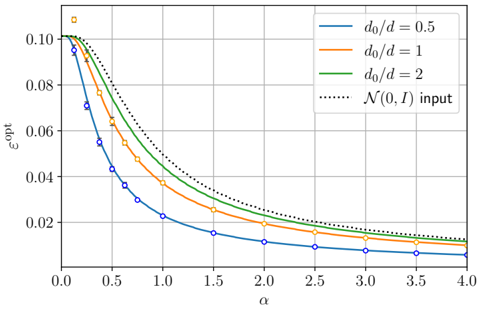
The graph depicts the relationship between the optimal ε (ε_opt) and the parameter α across three distinct d0/d ratios (0.5, 1, 2) and a baseline input distribution N(0,I). All data series exhibit a decreasing trend in ε_opt as α increases, with the N(0,I) input serving as an upper bound.
### Components/Axes
- **X-axis (α)**: Ranges from 0.0 to 4.0 in increments of 0.5. Labeled "α".
- **Y-axis (ε_opt)**: Ranges from 0.0 to 0.10 in increments of 0.02. Labeled "ε_opt".
- **Legend**: Located in the top-right corner, with four entries:
- Blue line: d0/d = 0.5
- Orange line: d0/d = 1
- Green line: d0/d = 2
- Dotted line: N(0,I) input
- **Data Points**: Blue circles (d0/d=0.5), orange squares (d0/d=1), green diamonds (d0/d=2), and black dotted line (N(0,I)).
### Detailed Analysis
1. **d0/d = 0.5 (Blue Line)**:
- Starts at ε_opt ≈ 0.10 at α=0.0.
- Declines steeply, reaching ε_opt ≈ 0.02 by α=4.0.
- Data points (blue circles) align closely with the line, with error bars decreasing in magnitude as α increases.
2. **d0/d = 1 (Orange Line)**:
- Begins at ε_opt ≈ 0.09 at α=0.0.
- Decreases gradually, reaching ε_opt ≈ 0.015 by α=4.0.
- Data points (orange squares) show moderate error bars, larger at lower α values.
3. **d0/d = 2 (Green Line)**:
- Starts at ε_opt ≈ 0.08 at α=0.0.
- Declines slowly, reaching ε_opt ≈ 0.012 by α=4.0.
- Data points (green diamonds) have smaller error bars compared to d0/d=1.
4. **N(0,I) Input (Dotted Line)**:
- Remains relatively flat, hovering near ε_opt ≈ 0.01–0.015 across all α.
- Acts as an upper bound for all d0/d ratios.
### Key Observations
- **Trend Verification**: All lines slope downward, confirming ε_opt decreases with increasing α. The d0/d=0.5 line has the steepest slope, while d0/d=2 has the gentlest.
- **Outliers/Anomalies**: No significant outliers; data points align with their respective lines. The N(0,I) input remains consistently above all d0/d ratios.
- **Spatial Grounding**: The legend is positioned in the top-right, ensuring clarity. Data points are spatially aligned with their corresponding lines (e.g., blue circles on the blue line).
### Interpretation
The graph demonstrates that ε_opt is inversely related to α, with lower d0/d ratios achieving higher ε_opt values initially but converging toward the N(0,I) input as α increases. This suggests that the parameter α acts as a regularization or scaling factor, reducing ε_opt toward the baseline input distribution's value. The error bars indicate decreasing uncertainty in ε_opt measurements as α grows, implying more stable estimates at higher α values. The N(0,I) input's flat trend highlights its role as a theoretical upper limit for ε_opt across all d0/d configurations.