## Line Graph: Loss Function Comparison
### Overview
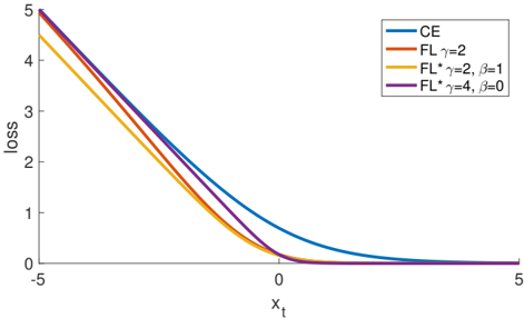
The image depicts a line graph comparing four loss functions (CE, FL γ=2, FL* γ=2, β=1, and FL* γ=4, β=0) across a range of input values (x_t). All lines originate from the same point (x_t = -5, loss = 5) and exhibit decreasing trends as x_t increases, with distinct divergence patterns after x_t = 0.
### Components/Axes
- **X-axis**: Labeled "x_t" with tick marks at -5, 0, and 5.
- **Y-axis**: Labeled "loss" with tick marks at 0, 1, 2, 3, 4, and 5.
- **Legend**: Located in the top-right corner, associating colors with functions:
- Blue: CE
- Orange: FL γ=2
- Yellow: FL* γ=2, β=1
- Purple: FL* γ=4, β=0
### Detailed Analysis
1. **CE (Blue Line)**:
- Starts at (x_t = -5, loss = 5).
- Decreases linearly until x_t = 0, where loss = 0.
- For x_t > 0, the loss increases slightly, forming a shallow upward curve.
2. **FL γ=2 (Orange Line)**:
- Starts at (x_t = -5, loss = 5).
- Decreases more steeply than CE until x_t = 0 (loss = 0).
- For x_t > 0, the loss rises sharply, surpassing the CE line.
3. **FL* γ=2, β=1 (Yellow Line)**:
- Starts at (x_t = -5, loss = 5).
- Decreases faster than CE but slower than FL γ=2 until x_t = 0 (loss = 0).
- For x_t > 0, the loss increases moderately, staying below FL γ=2 but above CE.
4. **FL* γ=4, β=0 (Purple Line)**:
- Starts at (x_t = -5, loss = 5).
- Decreases steepest among all lines until x_t = 0 (loss = 0).
- For x_t > 0, the loss rises sharply but remains below all other lines.
### Key Observations
- All lines converge at (x_t = 0, loss = 0), suggesting a shared minimum point.
- For x_t > 0, the purple line (FL* γ=4, β=0) maintains the lowest loss, while the orange line (FL γ=2) has the highest.
- The CE line diverges upward for x_t > 0, unlike the others, which continue decreasing before rising.
### Interpretation
The graph illustrates how loss functions behave under varying parameters (γ, β). Higher γ values (e.g., γ=4) with β=0 produce steeper initial declines but lower asymptotic loss values for x_t > 0. The inclusion of β=1 (yellow line) moderates the loss increase for x_t > 0 compared to β=0. The CE line’s unique upward trend for x_t > 0 suggests it penalizes positive x_t values differently, possibly reflecting a different regularization strategy. This analysis highlights the trade-offs between parameter choices in optimizing loss functions for specific input ranges.