## Heatmap: Spatial Distribution
### Overview
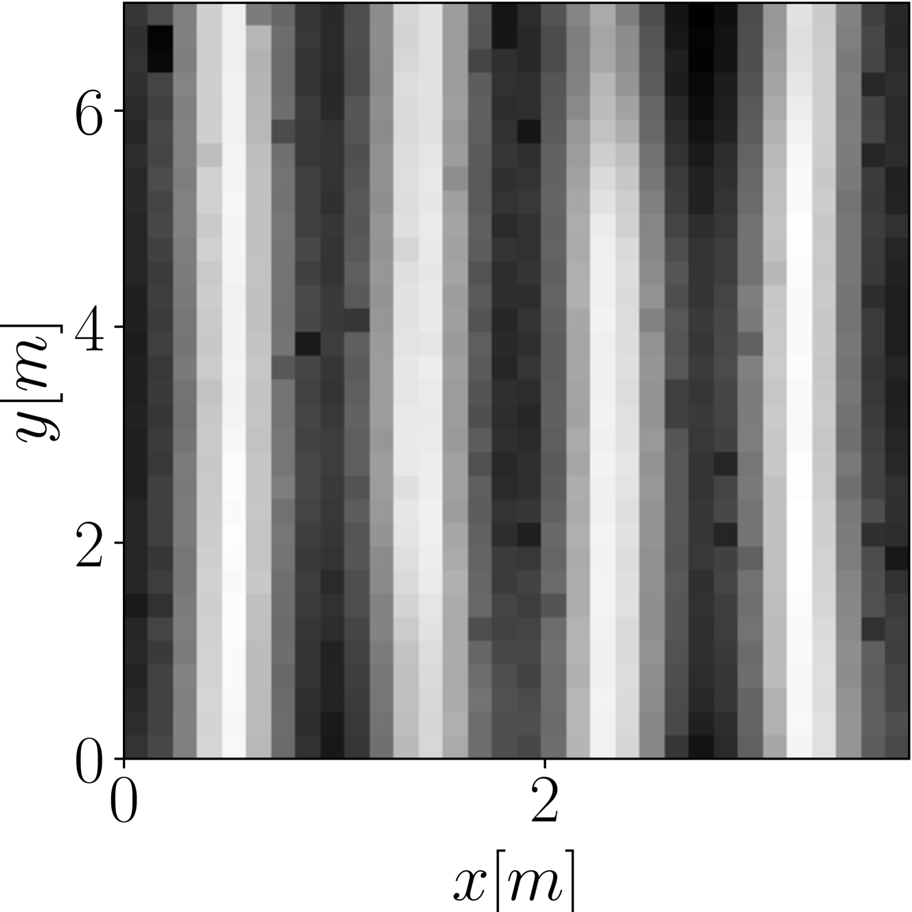
The image presents a heatmap visualizing a spatial distribution. The heatmap displays intensity variations across a two-dimensional space defined by x and y coordinates, both measured in meters (m). The intensity is represented by a grayscale color scheme, with darker shades indicating higher values and lighter shades indicating lower values. The data appears to be periodic in the x-direction.
### Components/Axes
* **X-axis:** Labeled "x [m]", ranging from approximately 0 to 2.5 meters. The axis is positioned along the bottom of the image.
* **Y-axis:** Labeled "y [m]", ranging from approximately 0 to 6.5 meters. The axis is positioned along the left side of the image.
* **Color Scale:** Grayscale, with darker shades representing higher intensity/values and lighter shades representing lower intensity/values. There is no explicit legend provided, so the exact mapping between grayscale and numerical values is unknown.
* **Data Representation:** The heatmap consists of a grid of rectangular cells, each colored according to its corresponding intensity value.
### Detailed Analysis
The heatmap exhibits a series of vertical stripes, suggesting a periodic pattern along the x-axis. The stripes are not uniform in intensity; they vary in darkness (and therefore value) along the y-axis.
Let's analyze the intensity distribution along the y-axis for a few representative x-values:
* **x ≈ 0.25 m:** The intensity is low at y ≈ 0 m, increases to a peak around y ≈ 2.5 m, then decreases again towards y ≈ 6.5 m. Approximate values: y=0: 0.2, y=2.5: 0.8, y=6.5: 0.3 (normalized to 0-1 scale).
* **x ≈ 0.75 m:** Similar pattern to x ≈ 0.25 m, but the peak intensity is slightly lower. Approximate values: y=0: 0.1, y=2.5: 0.6, y=6.5: 0.2.
* **x ≈ 1.25 m:** The intensity is relatively high across the entire y-axis, with a slight dip around y ≈ 4 m. Approximate values: y=0: 0.5, y=2.5: 0.9, y=4: 0.4, y=6.5: 0.6.
* **x ≈ 1.75 m:** Similar to x ≈ 0.25 m and 0.75 m, with a peak around y ≈ 2.5 m. Approximate values: y=0: 0.15, y=2.5: 0.7, y=6.5: 0.25.
* **x ≈ 2.25 m:** The intensity is low at y ≈ 0 m, increases to a peak around y ≈ 2.5 m, then decreases again towards y ≈ 6.5 m. Approximate values: y=0: 0.2, y=2.5: 0.8, y=6.5: 0.3.
The period of the stripes along the x-axis appears to be approximately 0.5 meters. The intensity variations along the y-axis seem to be somewhat consistent across different stripes, but with some variations in peak intensity and position.
### Key Observations
* The data exhibits a clear periodic pattern in the x-direction.
* The intensity distribution along the y-axis is not uniform, showing peaks and valleys.
* The peak intensity varies between different stripes.
* There is a noticeable dark band around x=1.25m.
### Interpretation
The heatmap likely represents a physical phenomenon that varies periodically in space. The x and y coordinates could represent spatial dimensions, and the intensity could represent a property such as temperature, pressure, or signal strength. The periodic pattern suggests a wave-like behavior or a repeating structure. The variations in peak intensity could be due to imperfections or disturbances in the system.
Without further context, it's difficult to determine the exact nature of the phenomenon being visualized. However, the data suggests a spatially varying field with a dominant periodic component. The dark band at x=1.25m could indicate a localized source or a region of increased activity. The heatmap could be a representation of an interference pattern, a standing wave, or a spatial distribution of a material property.