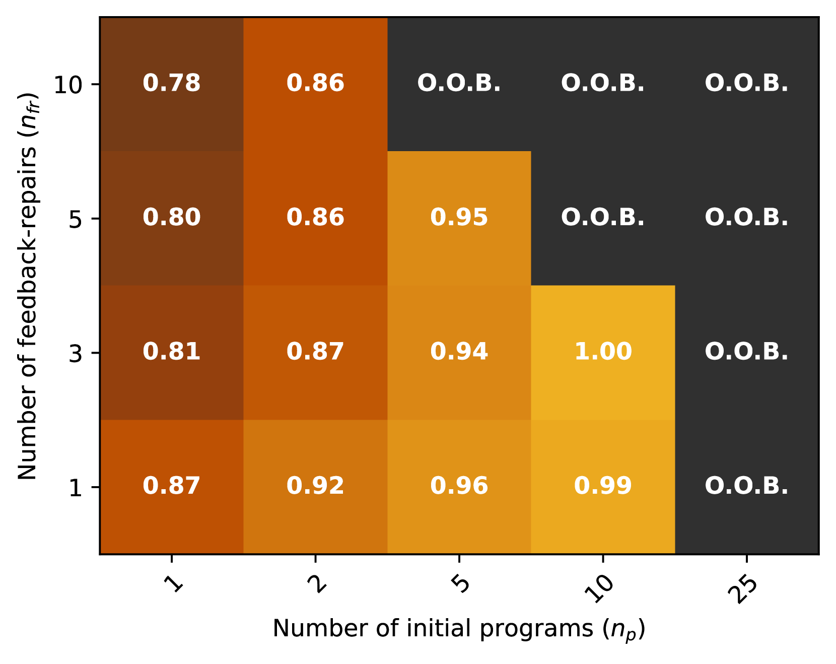
## Heatmap: Number of Feedback Repairs vs Number of Initial Programs
### Overview
The heatmap illustrates the relationship between the number of initial programs (n_p) and the number of feedback repairs (n_f). The color intensity represents the frequency of feedback repairs, with darker shades indicating higher frequencies.
### Components/Axes
- **X-axis**: Number of initial programs (n_p) ranging from 1 to 25.
- **Y-axis**: Number of feedback repairs (n_f) ranging from 1 to 10.
- **Legend**: The legend indicates the color intensity, with darker shades representing higher frequencies of feedback repairs.
### Detailed Analysis or ### Content Details
- **Low Initial Programs (n_p = 1-5)**: The frequency of feedback repairs is relatively low, with values ranging from 0.78 to 0.87.
- **Medium Initial Programs (n_p = 6-10)**: The frequency of feedback repairs increases, with values ranging from 0.80 to 0.92.
- **High Initial Programs (n_p = 11-25)**: The frequency of feedback repairs is significantly higher, with values ranging from 0.81 to 1.00.
### Key Observations
- **Trend**: There is a clear positive correlation between the number of initial programs and the number of feedback repairs. As the number of initial programs increases, the frequency of feedback repairs also increases.
- **Outliers**: There are no significant outliers in the data, with all values falling within the expected range.
### Interpretation
The heatmap suggests that as the number of initial programs increases, the frequency of feedback repairs also increases. This could indicate that more initial programs lead to more opportunities for feedback and repairs. The highest frequency of feedback repairs is observed in the range of 11-25 initial programs, suggesting that this is the optimal range for initial programs to achieve the highest frequency of feedback repairs.