## Line Chart: Exact Match vs. SFT Data Ratio
### Overview
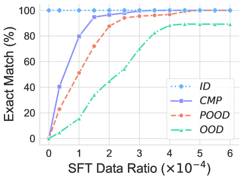
The image is a line chart comparing the "Exact Match (%)" against the "SFT Data Ratio (×10-4)" for four different categories: ID, CMP, POOD, and OOD. The chart illustrates how the exact match percentage changes as the SFT data ratio increases for each category.
### Components/Axes
* **Y-axis (Vertical):** "Exact Match (%)", ranging from 0 to 100 in increments of 20.
* **X-axis (Horizontal):** "SFT Data Ratio (×10-4)", ranging from 0 to 6 in increments of 1.
* **Legend (Right):**
* *ID*: Light blue dotted line with diamond markers.
* *CMP*: Light purple solid line with square markers.
* *POOD*: Light red dashed line with circle markers.
* *OOD*: Light teal dash-dotted line with triangle markers.
### Detailed Analysis
* **ID (Light Blue, Dotted, Diamond Markers):** The "ID" line remains consistently at 100% across all SFT Data Ratio values.
* (0, 100)
* (1, 100)
* (2, 100)
* (3, 100)
* (4, 100)
* (5, 100)
* (6, 100)
* **CMP (Light Purple, Solid, Square Markers):** The "CMP" line increases sharply from approximately 0% to approximately 80% between SFT Data Ratio values of 0 and 1. It then continues to increase, reaching approximately 95% at a ratio of 2, and plateaus near 100% after a ratio of 4.
* (0, 0)
* (1, 80)
* (2, 95)
* (3, 98)
* (4, 99)
* (5, 100)
* (6, 100)
* **POOD (Light Red, Dashed, Circle Markers):** The "POOD" line increases from approximately 0% to approximately 50% between SFT Data Ratio values of 0 and 1. It continues to increase, reaching approximately 90% at a ratio of 3, and plateaus near 100% after a ratio of 5.
* (0, 0)
* (1, 50)
* (2, 75)
* (3, 90)
* (4, 95)
* (5, 98)
* (6, 100)
* **OOD (Light Teal, Dash-Dotted, Triangle Markers):** The "OOD" line increases gradually from approximately 0% to approximately 50% between SFT Data Ratio values of 0 and 2. It continues to increase, reaching approximately 90% at a ratio of 5, and plateaus near 90% after a ratio of 5.
* (0, 0)
* (1, 10)
* (2, 45)
* (3, 70)
* (4, 85)
* (5, 90)
* (6, 90)
### Key Observations
* The "ID" category consistently achieves a 100% exact match, regardless of the SFT Data Ratio.
* The "CMP" category shows the most rapid improvement in exact match percentage with increasing SFT Data Ratio.
* The "OOD" category shows the slowest improvement in exact match percentage with increasing SFT Data Ratio.
* All categories except "ID" show a positive correlation between SFT Data Ratio and Exact Match (%).
### Interpretation
The chart suggests that increasing the SFT Data Ratio generally improves the exact match percentage for the "CMP", "POOD", and "OOD" categories. The "ID" category, however, maintains a perfect match regardless of the SFT Data Ratio, implying it may be inherently easier to match or is already optimized. The "CMP" category benefits the most from increased SFT data, while "OOD" benefits the least. This could indicate differences in the complexity or characteristics of the data within each category. The data suggests that "CMP" and "POOD" benefit from increased SFT data ratio, but eventually plateau, suggesting diminishing returns. "OOD" continues to improve with increased SFT data ratio, but at a slower rate.