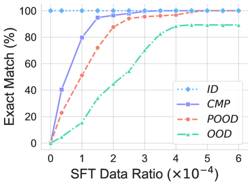
## Line Chart: Exact Match Performance vs. SFT Data Ratio
### Overview
This image is a line chart comparing the performance of four different methods or models (ID, CMP, POOD, OOD) on an "Exact Match" metric as a function of the "SFT Data Ratio." The chart demonstrates how each method's accuracy improves with increasing amounts of supervised fine-tuning (SFT) data.
### Components/Axes
* **Chart Type:** Multi-series line chart.
* **Y-Axis:**
* **Label:** "Exact Match (%)"
* **Scale:** Linear, from 0 to 100, with major tick marks every 20 units (0, 20, 40, 60, 80, 100).
* **X-Axis:**
* **Label:** "SFT Data Ratio (×10⁻⁴)"
* **Scale:** Linear, from 0 to 6, with major tick marks at every integer (0, 1, 2, 3, 4, 5, 6). The "(×10⁻⁴)" indicates the values are scaled; for example, "1" represents a ratio of 0.0001.
* **Legend:** Located in the bottom-right quadrant of the chart area. It contains four entries:
1. **ID:** Blue dotted line with diamond markers (♦).
2. **CMP:** Purple solid line with square markers (■).
3. **POOD:** Orange dashed line with circle markers (●).
4. **OOD:** Green dash-dot line with triangle markers (▲).
### Detailed Analysis
The chart plots the "Exact Match (%)" for each method at discrete "SFT Data Ratio" points. The following data points are approximate visual estimates:
**1. ID (Blue, Dotted, Diamonds):**
* **Trend:** Perfectly flat, horizontal line at the top of the chart.
* **Data Points:** Maintains 100% Exact Match across all SFT Data Ratios from 0 to 6.
**2. CMP (Purple, Solid, Squares):**
* **Trend:** Steep, rapid ascent from near 0% to near 100%, followed by a plateau.
* **Data Points:**
* Ratio 0: ~0%
* Ratio 0.5: ~40%
* Ratio 1: ~80%
* Ratio 1.5: ~95%
* Ratio 2: ~98%
* Ratios 3-6: Plateaus at ~100%.
**3. POOD (Orange, Dashed, Circles):**
* **Trend:** Steady, strong upward curve that approaches 100% more gradually than CMP.
* **Data Points:**
* Ratio 0: ~0%
* Ratio 0.5: ~22%
* Ratio 1: ~50%
* Ratio 1.5: ~72%
* Ratio 2: ~88%
* Ratio 3: ~95%
* Ratio 4: ~97%
* Ratios 5-6: Plateaus near ~99%.
**4. OOD (Green, Dash-Dot, Triangles):**
* **Trend:** Slower, more gradual ascent that begins to plateau at a lower level than the other methods.
* **Data Points:**
* Ratio 0: ~0%
* Ratio 1: ~15%
* Ratio 2: ~45%
* Ratio 3: ~70%
* Ratio 4: ~85%
* Ratio 5: ~90%
* Ratio 6: ~90% (Plateaus).
### Key Observations
1. **Performance Hierarchy:** At all non-zero data ratios, the performance order is consistent: ID (best) > CMP > POOD > OOD (worst).
2. **Data Efficiency:** CMP is the most data-efficient method among the three that start at 0%. It reaches near-perfect performance with a very small data ratio (≈1.5 x 10⁻⁴).
3. **Ceiling Effect:** The ID method appears to be a theoretical or ideal baseline, as it shows perfect performance regardless of data ratio.
4. **OOD Limitation:** The OOD method not only learns slower but also appears to hit a performance ceiling around 90%, suggesting a fundamental limitation in its ability to achieve exact matches compared to the other approaches.
5. **Convergence:** Both CMP and POOD converge to near 100% performance, but CMP requires significantly less data to get there.
### Interpretation
This chart likely illustrates a study on model robustness or generalization, comparing in-distribution (ID) performance against various out-of-distribution (OOD) or specialized training scenarios (CMP, POOD).
* **What the data suggests:** The "ID" line represents the upper-bound performance on familiar data. The other lines show how different training or evaluation strategies (CMP, POOD, OOD) recover this performance as they are exposed to more fine-tuning data. The steep rise of CMP suggests it is a highly effective strategy for quickly adapting to or handling a specific distribution shift. The slower rise and lower plateau of OOD indicate it represents a more challenging distribution shift that the model cannot fully overcome with additional data alone.
* **Relationship between elements:** The X-axis (data ratio) is the independent variable controlling the amount of adaptation. The Y-axis (exact match) is the dependent measure of success. The diverging paths of the lines highlight the varying difficulty of the tasks or distributions they represent.
* **Notable anomaly:** The perfect, flat line for "ID" is striking. It implies that for the in-distribution test set, the base model (with zero additional SFT data) already achieves 100% exact match, or that this line represents a different, non-adaptive benchmark. This serves as a control, emphasizing that the challenges shown for the other lines are due to distribution shift, not model incapability on the core task.