## Bar Chart: Comparison of Overall Accuracy for Two Methods
### Overview
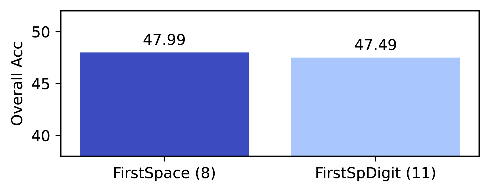
The image displays a bar chart comparing the "Overall Acc" (accuracy) of two methods: "FirstSpace (8)" and "FirstSpDigit (11)". The chart uses two vertical bars with distinct colors to represent the values, which are numerically labeled above each bar.
---
### Components/Axes
- **X-Axis**: Labeled with two categories:
- "FirstSpace (8)" (left bar)
- "FirstSpDigit (11)" (right bar)
- **Y-Axis**: Labeled "Overall Acc" with a scale from 40 to 50 in increments of 5.
- **Legend**: Not explicitly visible in the image, but colors are inferred:
- Dark blue for "FirstSpace (8)"
- Light blue for "FirstSpDigit (11)"
---
### Detailed Analysis
- **FirstSpace (8)**:
- Bar height corresponds to **47.99** (dark blue).
- Positioned on the left side of the chart.
- **FirstSpDigit (11)**:
- Bar height corresponds to **47.49** (light blue).
- Positioned on the right side of the chart.
- **Y-Axis**: Values are marked at 40, 45, and 50, with the bars occupying the upper portion of the scale.
---
### Key Observations
1. The two methods have nearly identical accuracy values, with "FirstSpace (8)" slightly outperforming "FirstSpDigit (11)" by **0.5**.
2. The bars are visually similar in height, emphasizing the minimal difference between the two.
3. The color distinction (dark vs. light blue) helps differentiate the categories despite the close values.
---
### Interpretation
The data suggests that both methods achieve high accuracy, with "FirstSpace (8)" marginally better than "FirstSpDigit (11)". The small difference (0.5) may indicate similar performance, but the context of the comparison (e.g., computational cost, dataset size, or application domain) is not provided. The use of distinct colors for the bars aids in visual differentiation, though the legend is missing, which could clarify the mapping of colors to categories. The chart’s simplicity focuses attention on the numerical values, which are critical for evaluating the methods’ effectiveness.