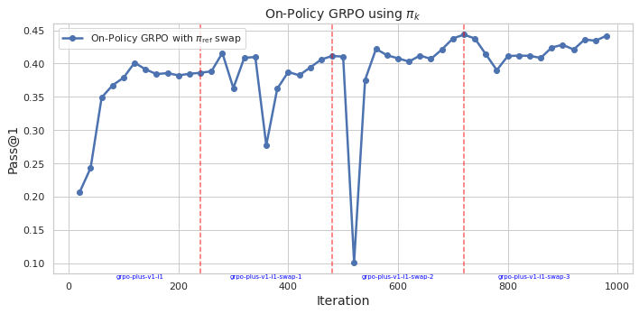
## Line Chart: On-Policy GRPO using πk
### Overview
This image presents a line chart illustrating the performance of an On-Policy GRPO algorithm using πk, measured by the Pass@1 metric, across iterations. The chart shows fluctuations in performance, with distinct dips coinciding with labeled "swap" events.
### Components/Axes
* **Title:** "On-Policy GRPO using πk" - positioned at the top-center of the chart.
* **X-axis:** "Iteration" - ranging from 0 to 1000, with tick marks at approximately 0, 200, 400, 600, 800, and 1000. Specific labels are: "grpo-plus-v1-1", "grpo-plus-v1-1-swap-1", "grpo-plus-v1-1-swap-2", "grpo-plus-v1-1-swap-3".
* **Y-axis:** "Pass@1" - ranging from 0.10 to 0.45, with tick marks at 0.10, 0.15, 0.20, 0.25, 0.30, 0.35, 0.40, and 0.45.
* **Data Series:** A single line labeled "On-Policy GRPO with πref swap" - colored in a dark blue.
* **Vertical Dashed Lines:** Four vertical dashed lines, colored in red and teal, are present. These lines are positioned at approximately iterations 200, 400, 600, and 800, and are labeled with "grpo-plus-v1-1-swap-1", "grpo-plus-v1-1-swap-2", "grpo-plus-v1-1-swap-3".
### Detailed Analysis
The line representing "On-Policy GRPO with πref swap" starts at approximately (0, 0.22). It then exhibits a steep upward trend, reaching a peak of approximately (200, 0.41). Following this peak, the line declines sharply to a low of approximately (400, 0.30), coinciding with the first dashed line. It then rises again to a peak of approximately (500, 0.42), before declining to a low of approximately (600, 0.36) at the second dashed line. The line then rises to a peak of approximately (700, 0.43), and declines to a low of approximately (800, 0.38) at the third dashed line. Finally, the line shows a slight upward trend, stabilizing around (900, 0.42) and (1000, 0.42).
Here's a more detailed breakdown of approximate data points:
* (0, 0.22)
* (100, 0.35)
* (200, 0.41)
* (300, 0.38)
* (400, 0.30)
* (500, 0.42)
* (600, 0.36)
* (700, 0.43)
* (800, 0.38)
* (900, 0.42)
* (1000, 0.42)
### Key Observations
The chart demonstrates a cyclical pattern in the Pass@1 metric. Each cycle consists of an increase in performance, followed by a sharp decline coinciding with a "swap" event. The magnitude of the performance decline appears to be relatively consistent across the observed swaps. The overall trend suggests that the algorithm is capable of learning and improving, but is periodically disrupted by the swap events.
### Interpretation
The data suggests that the "πref swap" mechanism, while potentially beneficial in some contexts, introduces instability into the learning process. The periodic dips in performance indicate that the swaps disrupt the algorithm's current state, requiring it to re-adapt. The consistent pattern of decline following each swap suggests that the swap process itself may be a source of inefficiency. The algorithm appears to recover from these disruptions, but the recovery process introduces a cyclical pattern in performance. Further investigation is needed to understand the underlying cause of these disruptions and to explore strategies for mitigating their impact. The chart highlights a trade-off between exploration (through swaps) and exploitation (through continued learning). The optimal balance between these two strategies likely depends on the specific characteristics of the environment and the algorithm's learning parameters.