\n
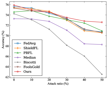
## Line Chart: Accuracy vs. Attack Ratio for Federated Learning Defense Methods
### Overview
The image is a line chart comparing the performance (accuracy) of seven different federated learning defense methods as the ratio of adversarial attacks increases. The chart demonstrates how each method's accuracy degrades under increasing adversarial pressure.
### Components/Axes
* **X-Axis (Horizontal):** Labeled "Attack ratio (%)". It represents the percentage of malicious participants or attacks in the system. The axis has major tick marks at 0, 10, 20, 30, 40, and 50.
* **Y-Axis (Vertical):** Labeled "Accuracy (%)". It represents the model's performance metric. The axis ranges from 62 to 76, with major tick marks every 2 units (62, 64, 66, 68, 70, 72, 74, 76).
* **Legend:** Located in the bottom-left corner of the chart area. It lists seven data series with corresponding colors and markers:
1. **FedAvg:** Blue line with square markers (□).
2. **ShieldFL:** Orange line with diamond markers (◇).
3. **PBFL:** Green line with upward-pointing triangle markers (△).
4. **Median:** Purple line with circle markers (○).
5. **Biscotti:** Gray line with star/asterisk markers (☆).
6. **FoolsGold:** Brown line with downward-pointing triangle markers (▽).
7. **Ours:** Red line with circle markers (○).
### Detailed Analysis
**Trend Verification:** All seven lines show a downward trend, indicating that accuracy decreases as the attack ratio increases. The rate of decline varies significantly between methods.
**Data Series Analysis (from highest to lowest final accuracy at 50% attack ratio):**
1. **Ours (Red line, ○):**
* **Trend:** The most resilient line, with the gentlest downward slope.
* **Approximate Data Points:** Starts at ~75.8% (0%), ~75.2% (10%), ~74.8% (20%), ~73.5% (30%), ~72.8% (40%), ends at ~72.6% (50%).
2. **FoolsGold (Brown line, ▽):**
* **Trend:** Very similar to "Ours" but consistently slightly lower. Also shows strong resilience.
* **Approximate Data Points:** Starts at ~75.6% (0%), ~75.0% (10%), ~74.6% (20%), ~73.4% (30%), ~72.4% (40%), ends at ~72.2% (50%).
3. **PBFL (Green line, △):**
* **Trend:** Moderate decline, performing better than the median group but worse than the top two.
* **Approximate Data Points:** Starts at ~74.8% (0%), ~74.4% (10%), ~73.8% (20%), ~73.0% (30%), ~72.4% (40%), ends at ~71.0% (50%).
4. **ShieldFL (Orange line, ◇):**
* **Trend:** Follows a path very close to PBFL, ending at a similar point.
* **Approximate Data Points:** Starts at ~75.4% (0%), ~75.0% (10%), ~74.6% (20%), ~73.2% (30%), ~71.0% (40%), ends at ~70.6% (50%).
5. **FedAvg (Blue line, □):**
* **Trend:** Starts as one of the highest but experiences a steeper drop after the 20% mark.
* **Approximate Data Points:** Starts at ~75.8% (0%), ~75.2% (10%), ~74.4% (20%), ~73.2% (30%), ~71.2% (40%), ends at ~70.6% (50%).
6. **Median (Purple line, ○):**
* **Trend:** Shows a consistent, significant decline across the entire range.
* **Approximate Data Points:** Starts at ~73.2% (0%), ~73.0% (10%), ~72.6% (20%), ~71.0% (30%), ~68.4% (40%), ends at ~68.2% (50%).
7. **Biscotti (Gray line, ☆):**
* **Trend:** The steepest and most severe decline of all methods. Its performance collapses dramatically as attacks increase.
* **Approximate Data Points:** Starts at ~74.4% (0%), ~73.2% (10%), ~71.2% (20%), ~68.2% (30%), ~66.0% (40%), ends at ~62.6% (50%).
### Key Observations
1. **Performance Hierarchy:** A clear hierarchy is established. "Ours" and "FoolsGold" form a top tier of robust methods. PBFL, ShieldFL, and FedAvg form a middle tier. Median and especially Biscotti are in a lower tier of vulnerability.
2. **Divergence Point:** The performance of the methods begins to diverge noticeably after the 10-20% attack ratio mark. The gap between the most robust ("Ours") and least robust ("Biscotti") widens from ~1.4% at 0% attack to a massive ~10% at 50% attack.
3. **Biscotti's Anomaly:** The Biscotti method is a significant outlier, showing a near-linear, steep degradation that is qualitatively different from the more gradual, curved declines of the other methods.
4. **FedAvg's Drop:** FedAvg starts competitively but its decline accelerates after 20%, causing it to fall from the top group to the middle group.
### Interpretation
This chart is a comparative robustness analysis for federated learning systems under adversarial attack. The data suggests that the proposed method ("Ours") achieves state-of-the-art resilience, maintaining over 72% accuracy even when half the participants are malicious. It marginally outperforms the strong baseline "FoolsGold."
The stark contrast with Biscotti indicates that its defense mechanism is fundamentally less effective against the modeled attacks, suffering catastrophic failure as the threat scale increases. The clustering of PBFL, ShieldFL, and FedAvg suggests these methods share similar, moderate levels of robustness.
The chart effectively argues for the superiority of the "Ours" method by demonstrating not just a higher starting point, but a significantly slower rate of decay. The widening performance gap at higher attack ratios is the most critical finding, highlighting the practical importance of the proposed approach in high-threat environments. The visualization successfully isolates the impact of the attack ratio variable on the core performance metric (accuracy) across multiple competing solutions.