## Histogram: Distribution of Scientists by Top Percentage
### Overview
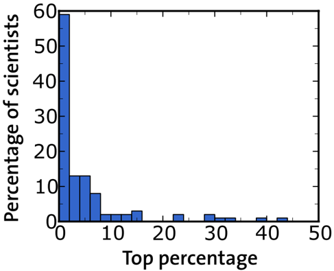
The image is a histogram showing the distribution of scientists based on their "Top percentage". The y-axis represents the percentage of scientists, and the x-axis represents the top percentage. The histogram bars are blue.
### Components/Axes
* **Y-axis:** "Percentage of scientists", ranging from 0 to 60. Increments of 10 are marked.
* **X-axis:** "Top percentage", ranging from 0 to 50. Increments of 10 are marked.
### Detailed Analysis
The histogram bars represent the frequency of scientists within specific "Top percentage" ranges.
* **0-1%:** Approximately 58% of scientists.
* **1-2%:** Approximately 13% of scientists.
* **2-3%:** Approximately 10% of scientists.
* **3-4%:** Approximately 8% of scientists.
* **4-5%:** Approximately 2% of scientists.
* **5-6%:** Approximately 2% of scientists.
* **6-7%:** Approximately 2% of scientists.
* **7-8%:** Approximately 1% of scientists.
* **8-9%:** Approximately 1% of scientists.
* **9-10%:** Approximately 1% of scientists.
* **10-11%:** Approximately 3% of scientists.
* **11-12%:** Approximately 3% of scientists.
* **12-13%:** Approximately 1% of scientists.
* **13-14%:** Approximately 1% of scientists.
* **14-15%:** Approximately 1% of scientists.
* **24-25%:** Approximately 2% of scientists.
* **29-30%:** Approximately 2% of scientists.
* **30-31%:** Approximately 1% of scientists.
* **31-32%:** Approximately 1% of scientists.
* **39-40%:** Approximately 2% of scientists.
* **40-41%:** Approximately 1% of scientists.
* **41-42%:** Approximately 1% of scientists.
### Key Observations
* The distribution is heavily skewed to the left, indicating that a large percentage of scientists fall within the lower "Top percentage" ranges.
* The highest percentage of scientists is in the 0-1% range.
* The frequency of scientists decreases significantly as the "Top percentage" increases.
### Interpretation
The histogram suggests that a majority of scientists are clustered within the lower end of the "Top percentage" metric. This could indicate that the metric being measured is one where high performance is relatively rare, or that the population being measured is one where most individuals are not considered top performers. The rapid decline in the percentage of scientists as the "Top percentage" increases suggests a power-law or exponential decay relationship.