\n
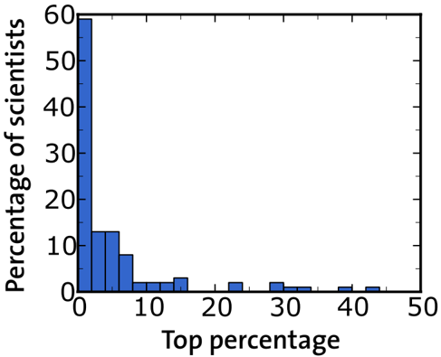
## Histogram: Distribution of Scientists in Top Percentages
### Overview
The image presents a histogram illustrating the distribution of scientists across different top percentage categories. The x-axis represents the "Top percentage" and the y-axis represents the "Percentage of scientists". The data is presented as a series of bars, each representing the percentage of scientists falling within a specific top percentage range.
### Components/Axes
* **X-axis Label:** "Top percentage"
* Scale: 0 to 50, with increments of 10.
* **Y-axis Label:** "Percentage of scientists"
* Scale: 0 to 60, with increments of 10.
* **Data Series:** A single series of bars representing the distribution.
* **No Legend:** There is no legend present in the image.
### Detailed Analysis
The histogram shows a heavily right-skewed distribution. The highest concentration of scientists falls within the 0-5% top percentage range, with approximately 58% of scientists represented. The percentage of scientists decreases rapidly as the top percentage increases.
Here's a breakdown of approximate values based on bar heights:
* 0-5%: ~58%
* 5-10%: ~14%
* 10-15%: ~8%
* 15-20%: ~5%
* 20-25%: ~3%
* 25-30%: ~2%
* 30-35%: ~1%
* 35-40%: ~0.5%
* 40-45%: ~0.3%
* 45-50%: ~0.2%
The bars are of varying widths, each representing a 5-unit range on the x-axis. The height of each bar corresponds to the percentage of scientists within that range.
### Key Observations
* The distribution is strongly skewed to the right, indicating that a large proportion of scientists are concentrated in the lower top percentage ranges.
* The percentage of scientists rapidly declines as the top percentage increases.
* Very few scientists are represented in the higher top percentage ranges (above 30%).
### Interpretation
The data suggests a hierarchical structure within the scientific community, where a relatively small number of scientists achieve very high rankings (top percentages). The steep decline in the percentage of scientists as the top percentage increases indicates a competitive landscape, with diminishing returns in terms of representation at higher levels. This could reflect factors such as research impact, publication rates, or citation counts. The histogram provides a visual representation of the distribution of success or recognition within the scientific field. It is important to note that the data does not specify *what* constitutes being in the "top percentage" – it could be based on various metrics. The data also does not provide information about the total number of scientists represented in the sample.