## Histogram: Distribution of Scientists Across Top Percentage Brackets
### Overview
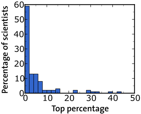
The image displays a histogram (bar chart) illustrating the distribution of scientists across different "Top percentage" categories. The chart shows a highly skewed distribution, with a very high concentration of scientists in the lowest percentage bracket, followed by a rapid decline.
### Components/Axes
* **Chart Type:** Histogram / Bar Chart.
* **Y-Axis (Vertical):**
* **Label:** "Percentage of scientists"
* **Scale:** Linear scale from 0 to 60.
* **Major Tick Marks:** 0, 10, 20, 30, 40, 50, 60.
* **X-Axis (Horizontal):**
* **Label:** "Top percentage"
* **Scale:** Linear scale from 0 to 50.
* **Major Tick Marks:** 0, 10, 20, 30, 40, 50.
* **Minor Tick Marks:** Appear at intervals of 5 units (e.g., 5, 15, 25, 35, 45).
* **Data Series:** A single series represented by blue vertical bars. There is no legend, as only one data category is plotted.
* **Spatial Layout:** The chart is centered within the frame. The y-axis is positioned on the left, and the x-axis is at the bottom. The bars originate from the x-axis.
### Detailed Analysis
The histogram consists of bars representing discrete bins along the "Top percentage" axis. The height of each bar corresponds to the "Percentage of scientists" in that bin. Values are approximate based on visual estimation against the y-axis scale.
| Approximate "Top percentage" Bin (X-axis) | Approximate "Percentage of scientists" (Y-axis) | Visual Trend Description |
| :--- | :--- | :--- |
| 0 - 5 | ~60% | This is the tallest bar by a significant margin, indicating the majority of scientists fall within this lowest "Top percentage" bracket. |
| 5 - 10 | ~13% | A sharp drop from the first bar. |
| 10 - 15 | ~8% | Continues the steep downward trend. |
| 15 - 20 | ~2% | Very low percentage. |
| 20 - 25 | ~2% | Similar height to the previous bin. |
| 25 - 30 | ~3% | Slight increase from the previous two bins. |
| 30 - 35 | ~2% | Returns to a very low level. |
| 35 - 40 | ~1% | Barely visible bar. |
| 40 - 45 | ~1% | Barely visible bar. |
| 45 - 50 | ~1% | Barely visible bar. |
**Trend Verification:** The data series exhibits a classic "long tail" or power-law distribution. The line formed by the tops of the bars slopes sharply downward from left to right, with the most significant drop occurring between the first and second bins.
### Key Observations
1. **Extreme Skew:** The distribution is heavily right-skewed. Approximately 60% of scientists are concentrated in the 0-5% "Top percentage" bracket.
2. **Rapid Decay:** The percentage of scientists drops precipitously after the first bin. By the 10-15% bracket, the value is less than one-seventh of the initial value.
3. **Long Tail:** A very small but non-zero percentage of scientists (approximately 1-3% per bin) is distributed across the higher "Top percentage" brackets from 15% to 50%.
4. **No Mid-Range Peak:** There is no secondary peak or plateau in the middle of the distribution; it is a continuous, steep decline followed by a low, flat tail.
### Interpretation
This histogram visually demonstrates a phenomenon consistent with the **Pareto Principle (80/20 rule)** or a **power-law distribution**, commonly observed in metrics of scientific impact, productivity, or citation counts.
* **What the data suggests:** The label "Top percentage" is ambiguous without further context, but it likely refers to a ranking metric (e.g., top X% of scientists by citations, publications, or h-index). The chart shows that an overwhelming majority of scientists (~60%) are found in the very top tier (0-5%), while progressively fewer scientists are found in the subsequent, broader tiers. This implies a high degree of inequality or concentration in whatever metric is being measured.
* **How elements relate:** The x-axis ("Top percentage") represents increasingly inclusive or broader categories of scientists. The y-axis shows the proportion of the total scientist population that falls into each category. The relationship is inverse and non-linear: as the category broadens (moving right on the x-axis), the proportion of scientists it contains shrinks dramatically.
* **Notable anomalies/implications:** The most striking feature is the dominance of the first bin. If "Top percentage" refers to performance, this could indicate that a large group of scientists is clustered at a high-performance threshold, with a rapid drop-off to a smaller group of extreme outliers in the long tail. Alternatively, if the bins represent percentiles (e.g., top 5%, top 10%), the chart shows that the "top 5%" category itself contains 60% of the population, which would be a paradoxical labeling. This highlights the critical need for precise definitions of the axis labels to correctly interpret the data's real-world meaning. The chart effectively communicates extreme concentration, regardless of the specific metric.