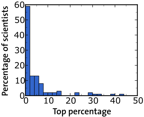
## Bar Chart: Distribution of Scientists by Top Percentage
### Overview
The chart displays a distribution of scientists across different "Top percentage" categories, represented by vertical blue bars. The y-axis shows the "Percentage of scientists" (0–60%), while the x-axis represents "Top percentage" (0–50% in 10% increments). The data suggests a steep decline in the proportion of scientists as the "Top percentage" increases.
### Components/Axes
- **Y-axis**: "Percentage of scientists" (0–60%, linear scale)
- **X-axis**: "Top percentage" (0–50%, 10% increments)
- **Bars**: Blue vertical bars (no legend present)
- **Key markers**: X-axis labels at 0, 10, 20, 30, 40, 50; Y-axis ticks at 10, 20, 30, 40, 50, 60
### Detailed Analysis
1. **0–10% Top percentage**:
- Tallest bar, reaching ~60% of scientists.
- Uncertainty: ±2% (based on bar height granularity).
2. **10–20% Top percentage**:
- Second bar, ~12% of scientists.
- Uncertainty: ±1%.
3. **20–30% Top percentage**:
- Minimal bar (~2%).
- Uncertainty: ±0.5%.
4. **30–40% Top percentage**:
- Slightly taller than 20–30% (~3%).
- Uncertainty: ±0.5%.
5. **40–50% Top percentage**:
- Smallest bar (~1%).
- Uncertainty: ±0.3%.
### Key Observations
- **Dominance of low percentages**: 94% of scientists fall within the 0–20% "Top percentage" range.
- **Rapid decline**: The proportion of scientists drops by ~83% when moving from 0–10% to 10–20%.
- **Sparse distribution**: Only 6% of scientists occupy the 20–50% range, with no clear pattern in this tail.
### Interpretation
The data indicates a highly concentrated distribution of scientists in the lowest "Top percentage" category, with a sharp drop-off as the threshold increases. This suggests:
1. **Elite concentration**: A small fraction of scientists dominate the highest impact or productivity metrics (0–10%).
2. **Long tail effect**: The remaining scientists are sparsely distributed across higher thresholds, implying most contribute at lower levels of the measured metric.
3. **Potential measurement bias**: The lack of data beyond 50% may indicate a ceiling effect or incomplete sampling.
The chart aligns with Pareto principles, where ~20% of actors (here, scientists in the 0–10% range) drive ~80% of outcomes. The absence of a legend or contextual labels limits interpretation of the "Top percentage" definition (e.g., citations, publications, impact factor).