## Line Chart: Exact Match vs. SFT Data Ratio
### Overview
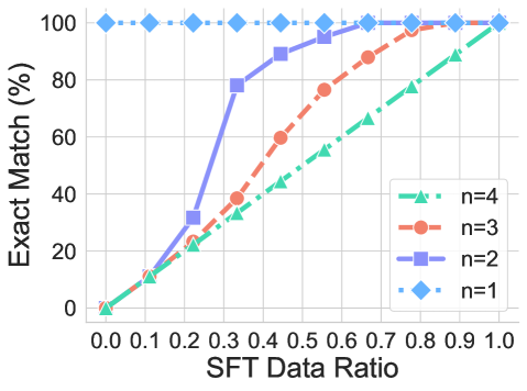
This image is a line chart illustrating the relationship between the "SFT Data Ratio" (x-axis) and the "Exact Match (%)" (y-axis) across four different experimental conditions, labeled as $n=1$ through $n=4$. The chart demonstrates how increasing the data ratio improves the exact match percentage, with the rate of improvement varying significantly based on the value of $n$.
### Components/Axes
* **Y-Axis:** Labeled "Exact Match (%)". The scale ranges from 0 to 100 in increments of 20.
* **X-Axis:** Labeled "SFT Data Ratio". The scale ranges from 0.0 to 1.0 in increments of 0.1.
* **Legend:** Positioned in the bottom-right quadrant of the chart area.
* **n=4:** Teal color, triangle marker, dash-dot line style.
* **n=3:** Orange/Red color, circle marker, dashed line style.
* **n=2:** Purple color, square marker, solid line style.
* **n=1:** Light blue color, diamond marker, dotted line style.
### Detailed Analysis
The chart displays four distinct data series. Below are the approximate values extracted from the visual representation:
| SFT Data Ratio | n=1 (Light Blue) | n=2 (Purple) | n=3 (Orange) | n=4 (Teal) |
| :--- | :--- | :--- | :--- | :--- |
| **0.0** | 100% | 0% | 0% | 0% |
| **0.1** | 100% | ~12% | ~12% | ~11% |
| **0.2** | 100% | ~32% | ~24% | ~22% |
| **0.3** | 100% | ~78% | ~38% | ~33% |
| **0.4** | 100% | ~90% | ~60% | ~44% |
| **0.5** | 100% | ~95% | ~76% | ~55% |
| **0.6** | 100% | 100% | ~88% | ~66% |
| **0.7** | 100% | 100% | ~98% | ~77% |
| **0.8** | 100% | 100% | 100% | ~88% |
| **0.9** | 100% | 100% | 100% | ~95% |
| **1.0** | 100% | 100% | 100% | 100% |
**Trend Verification:**
* **n=1 (Light Blue):** This series is a horizontal line at 100%, indicating perfect performance regardless of the data ratio.
* **n=2 (Purple):** This series shows a sharp, sigmoidal upward trend. It remains low until 0.2, spikes significantly between 0.2 and 0.4, and plateaus at 100% by 0.6.
* **n=3 (Orange):** This series shows a steady, linear-to-curved upward trend, reaching 100% at approximately 0.8.
* **n=4 (Teal):** This series shows the slowest, most linear upward trend, requiring the full data ratio (1.0) to reach 100% accuracy.
### Key Observations
* **Inverse Efficiency:** There is a clear inverse relationship between the value of $n$ and the efficiency of the model (or process) in achieving an "Exact Match." Lower values of $n$ reach 100% accuracy with significantly less data.
* **Outlier:** The $n=1$ condition is an outlier, as it maintains 100% accuracy across the entire spectrum, suggesting it is either a trivial task or a baseline that does not require fine-tuning data.
* **Convergence:** All four lines converge at the (1.0, 100%) coordinate.
### Interpretation
This chart likely represents the performance of a machine learning model (such as an LLM) undergoing Supervised Fine-Tuning (SFT).
* **"SFT Data Ratio"** likely refers to the percentage of the training dataset utilized.
* **"n"** likely represents the complexity of the task or the number of "shots" (examples) provided in a prompt.
* **The Data Suggests:** As the complexity of the task ($n$) increases, the model requires a higher proportion of the fine-tuning dataset to achieve perfect "Exact Match" performance.
* **Reading Between the Lines:** The sharp jump in the $n=2$ curve suggests a "tipping point" where the model suddenly learns the task pattern effectively once a certain threshold of data (around 0.2–0.3) is provided. Conversely, $n=4$ appears to be a much harder task, requiring a linear increase in data to improve performance, suggesting that the model struggles to generalize this task without a substantial amount of training data.